Monitoring looks reassuring right up to the moment it fails to show the thing that matters. A dashboard can stay green while users hit timeouts, background jobs stall, data pipelines skip records, or a dependency at the edge starts wobbling. That is why monitoring setup mistakes are harder than ordinary configuration mistakes: they do not just create noise, they can create false calm. The setup appears present, the charts keep moving, and the team assumes the system is visible. Sometimes it is not.
Why This Topic Carries More Risk Than It First Appears
A broken feature is usually visible. A broken visibility layer is more slippery. When the monitoring model is incomplete, the system can fail in places the team never measures, or fail in ways the team cannot separate from normal variation. That is why a weak setup often turns a short incident into a long one.
There is also a timing problem. Many monitoring errors are planted early and only show up under load, during a deployment, after a schema change, or when a third-party service slows down. By then, the team is debugging with partial light. It is a little like a smoke alarm with dead batteries: still mounted, still trusted, not actually helping.
Common Assumptions That Create Blind Spots
- If the dashboard is green, users are probably fine. Not always. Internal health can look normal while login, checkout, search, or background processing is already failing at the edges.
- If data stops arriving, there is probably no issue. Sometimes the data path is what failed.
- If averages look stable, performance is stable. Averages often hide spikes, tail latency, and uneven failures.
- If CPU and memory look normal, the service is healthy. Resource usage is only one slice of system behavior.
- If alerts exist, ownership exists. An alert without a responder, context, and action path is often just a loud decoration.
- If one telemetry type exists, visibility exists. Metrics alone, logs alone, or traces alone can leave important gaps.
| Setup Choice | What It Hides | What Usually Happens Later |
|---|---|---|
| Only infrastructure metrics | User-facing errors, slow requests, failed workflows | Incidents are discovered by customers, support, or sales |
| No handling for missing data | Collector, exporter, or query failures | Silence is misread as health |
| Averages without distribution views | Spikes, tail latency, partial slowness | Teams dismiss “random” complaints until they pile up |
| No dependency monitoring | Third-party or internal downstream failures | Root cause is searched in the wrong service |
| No meta-monitoring | Alerting and ingestion failures | The monitoring stack fails during the same incident it should reveal |
One practical test: if one signal disappears, would the team read that as “healthy” or “blind”? That single question catches more setup weakness than many polished dashboards do.
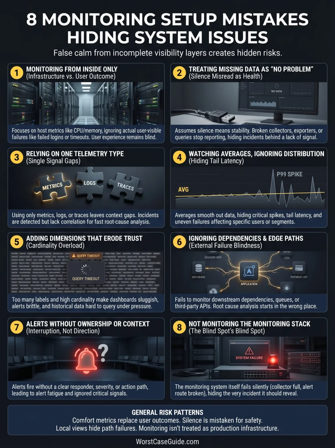
8 Monitoring Setup Mistakes That Hide System Issues
Mistake 1: Monitoring The System From The Inside Only
A common setup starts with host metrics, container status, CPU, memory, and maybe disk. Those are useful, but they describe the inside condition of components, not always the user-visible outcome. A service can stay “up” while requests fail, queues back up, sessions expire, or a checkout step breaks only for one region or one payment path.
Why It Happens
Infrastructure metrics are easier to collect early. They arrive quickly, look tidy, and feel objective. Product and workflow signals usually need more design work, more naming discipline, and closer contact with the actual customer journey.
Early Warning Signs
- Dashboards focus on servers, pods, and nodes, but not on failed sign-ins, failed checkouts, or stalled jobs.
- Support tickets reveal issues before alerts do.
- The team can answer “Is the host healthy?” faster than “Can the user finish the task?”
Worst-Case Result
The team sees a healthy platform while revenue paths, customer workflows, or internal processing are already degraded. Detection comes late, and the first real alert is often a human one.
A Safer Approach
User-path monitoring usually lowers this risk: request success, latency at important percentiles, job completion, queue age, retry rate, and business-step outcomes. In smaller projects, even a short list of “must-work” journeys can change the picture. In larger systems, the safer model is a layered one: infrastructure health below, service behavior in the middle, and user outcomes above.
Mistake 2: Treating Missing Data As “No Problem”
This is one of the quietest failures. A metric disappears, a scrape stops, an exporter dies, a query breaks, or an alerting rule returns nothing. The chart goes flat or blank. Nobody is quite sure what that means. And silence starts to look normal.
Why It Happens
Teams often design alerts around bad values, not around missing signals. They assume the monitor is present unless it explicitly says otherwise. That assumption is easy to miss during setup because data is still flowing in test environments.
Early Warning Signs
- Blank graphs are manually ignored.
- Collectors, exporters, or agents have no health alerts of their own.
- Alert rules do not define what should happen when queries return no data.
Worst-Case Result
The monitoring path fails first, then a production issue happens behind that curtain. The team believes the service is calm when the setup is simply blind.
A Safer Approach
It usually helps to treat telemetry absence as its own condition. Separate alerts for missing scrapes, dead agents, delayed pipelines, stalled ingestion, and empty result states make the meaning of silence much clearer. If a signal disappears, the setup should say so plainly.
Mistake 3: Relying On One Telemetry Type
Metrics are good at showing shape over time. Logs show event detail. Traces help with request paths and cross-service delay. When a setup leans on only one of them, some failures stay fuzzy. What looks like a small latency shift in a chart may turn out to be one slow downstream call, one bad retry loop, or one tenant-specific error pattern.
Why It Happens
Single-signal setups are simpler to launch. They also feel cheaper, which matters. Still, lower setup effort can mean higher investigation effort later, especially once the architecture spreads across services, queues, caches, and third-party APIs.
Early Warning Signs
- Alerts fire, but responders still need multiple manual steps before they know where to look.
- Dashboards show slowness, yet there is no path-level evidence for where time is spent.
- Logs exist, though they cannot be tied back to the request or job that triggered them.
Worst-Case Result
Incidents are detected but not explained. Mean time to detect looks decent on paper; mean time to understand does not. The team has signals, though not enough correlation to use them well.
A Safer Approach
A balanced setup usually links metrics, logs, and traces around shared service names, environments, request IDs, and job identifiers. Not every system needs every signal at the same depth. Still, most production setups benefit when the responder can move from an alert to a trace, then to a filtered log view, without rebuilding context by hand.
Mistake 4: Watching Averages And Ignoring Distribution
An average response time can stay tidy while one slice of traffic is hurting badly. The same is true for job duration, cache latency, queue delay, and page load. Averages smooth the picture. That is their job. But a smoother picture is not always a truer picture.
Why It Happens
Averages are easy to explain in meetings and easy to place on dashboards. Percentiles, distributions, segment views, and error buckets ask for more design and more discipline in instrumentation.
Early Warning Signs
- Dashboards show mean values but not percentiles or bucketed error patterns.
- Users describe “sometimes slow” while charts show “stable enough.”
- One region, tenant, route, or device class fails more often, but aggregate views hide it.
Worst-Case Result
Teams dismiss early complaints because the overall numbers look fine. By the time the issue becomes visible in averages, it has already widened. What looks neat on the main screen can turn into a stage set.
A Safer Approach
For latency and duration, it often helps to view distribution, not just mean values. For errors, segmenting by route, dependency, tenant size, region, or workflow step can reveal partial failure patterns early. If you are in a low-traffic system, broad buckets may be enough. If you are in a high-traffic system, tail behavior matters much more than one blended average.
Mistake 5: Adding Dimensions That Make Data Harder To Trust
More detail sounds safer. Often it is. Yet monitoring data can become harder to query, slower to load, and more expensive to retain when labels or dimensions multiply without clear limits. The strange part is that this does not just affect cost. It can also hide issues by making dashboards sluggish, alerts brittle, and analysis noisy.
Why It Happens
Teams want maximum drill-down later, so they attach user IDs, raw paths, session tokens, or many changing values to metrics. It feels future-proof for a while. Then cardinality grows, storage pressure rises, and query behavior becomes less predictable.
Early Warning Signs
- Dashboards take longer to render every month.
- Alert rules time out or are quietly simplified until they miss context.
- Metric names and labels are hard to explain without opening code.
Worst-Case Result
The monitoring system becomes heavy enough that teams reduce retention, reduce detail, or stop asking certain questions because the setup can no longer answer them quickly. Visibility fades in slow motion.
A Safer Approach
A cleaner metric model usually helps more than a denser one. Stable dimensions, bounded values, careful route templates, and separate event detail in logs keep the data shape useful. Put simply, detail belongs where it can still be queried under pressure.
Mistake 6: Ignoring Dependencies, Queues, And Edge Paths
Many incidents begin outside the service that first looks guilty. A database call slows down. A payment provider returns sporadic errors. A queue consumer falls behind. An email vendor delays webhooks. A CDN edge caches the wrong thing. If the setup watches only the core application, responders can spend the first hour interrogating the wrong suspect.
Why It Happens
Dependencies are awkward to monitor. Some are owned by other teams. Some are external. Some fail only at the boundary between systems, which means each local dashboard looks half-correct on its own.
Early Warning Signs
- The service dashboard has no view of downstream error rates, latency, retry volume, or queue age.
- Third-party calls are counted, but not segmented by outcome type.
- Synthetic checks stop at the homepage or health endpoint and never touch deeper flows.
Worst-Case Result
Root-cause analysis starts in the wrong place. Teams roll back good releases, restart healthy services, or chase local metrics while the actual issue sits in a dependency path nobody mapped well enough.
A Safer Approach
Dependency-aware monitoring usually lowers that risk: downstream latency, timeout rate, saturation of workers, queue depth or age, retry loops, circuit-breaker state, and edge-path checks for important workflows. In smaller projects, a short dependency register can be enough. In larger systems, the setup often needs explicit service maps, handoff points, and ownership boundaries.
Mistake 7: Creating Alerts Without Ownership Or Action Context
An alert is not useful just because it fires. It needs a responder, a severity level, enough context to start, and some clue about what kind of action might help. Otherwise teams get the worst of both worlds: interruption without direction.
Why It Happens
Alert rules are often added as systems grow, one incident at a time. That creates a pile of reactions, not a clean alert model. Over time, thresholds drift, duplicate rules appear, and route ownership becomes fuzzy.
Early Warning Signs
- Different alerts point to the same issue but go to different channels.
- Responders mute noisy rules instead of tuning them.
- The first question after an alert is, “Who owns this?”
Worst-Case Result
True issues are buried in alert fatigue, while low-value alerts train people to look away. Detection exists on paper, though the human system around it has stopped trusting the signal.
A Safer Approach
Useful alerts tend to be tied to symptoms that matter, routed to named owners, grouped by incident shape, and paired with clear context. Not every rule needs a long playbook. Still, every serious alert should answer three quiet questions before it fires: who should care, why now, and what changed.
Mistake 8: Not Monitoring The Monitoring Stack
This is the mistake teams usually understand right after living through it once. The collector fills up, the alert manager route breaks, storage falls behind, the dashboard backend slows down, or a permissions change blocks ingestion. Then a real incident happens at the same time. What could go wrong? Quite a lot, actually.
Why It Happens
Monitoring is often treated as a support layer rather than a production service with its own failure modes. That mindset keeps meta-monitoring off the roadmap until the pain becomes undeniable.
Early Warning Signs
- No health checks for collectors, scrapers, agents, storage, or notification routes.
- No alert for delayed ingestion or failed rule evaluation.
- No test path that proves a real notification can still reach the right team.
Worst-Case Result
The visibility stack fails during the same outage it was meant to reveal. Incident response slows down, trust drops, and post-incident review becomes blurry because the evidence trail is incomplete.
A Safer Approach
A safer setup treats monitoring as a product of its own: health metrics, queue delay, rule evaluation status, storage pressure, notification delivery checks, and periodic end-to-end tests. If the system depends on monitoring to stay stable, the monitoring layer deserves the same care as the services it watches. Usually that is the dividing line between “we have dashboards” and we can trust our visibility.
General Risk Patterns Behind These Mistakes
The mistakes above look different, though they tend to come from the same few patterns.
- Comfort metrics replace outcome metrics. Teams measure what is easy to collect, not what best reflects user harm.
- Silence is treated as safety. Missing data, dead agents, and broken routes are left ambiguous.
- Local visibility replaces path visibility. Each component looks fine alone, while the request path fails between them.
- Instrumentation grows without naming discipline. More data arrives, but understanding does not keep pace.
- The human side of alerting is ignored. Ownership, severity, grouping, and actionability are treated as extras.
- Monitoring is not treated as production infrastructure. So it is trusted more than it is tested.
That last pattern matters more than it seems. A weak monitoring setup rarely fails with a loud message that says, “I am unreliable now.” It drifts. It gets noisier in one area, thinner in another, slower under pressure, and more dependent on tribal memory. Then one day a team needs clean signal fast and finds out it has been working with blurred glass.
FAQ
What is the most common monitoring setup mistake?
The most common one is watching internal resource health without watching user-facing outcomes. CPU, memory, and pod status can look normal while failed requests, stuck jobs, or broken workflows are already affecting people.
Why is missing data so dangerous in monitoring?
Because teams often read silence as stability. When data collection, scraping, query execution, or alert routing fails, the setup may stop reporting trouble at the exact moment trouble begins.
Are dashboards enough to detect system issues early?
Not by themselves. Dashboards are useful for inspection, but early detection usually depends on alerts, symptom-based signals, dependency views, and clear ownership. A dashboard nobody checks during the right hour is still a blind spot.
Should monitoring focus on metrics, logs, or traces?
Most systems benefit from a mix. Metrics show behavior over time, logs show event detail, and traces show request paths. The exact balance depends on system shape, traffic, and incident patterns.
How can smaller teams reduce monitoring blind spots without a huge setup?
Smaller teams often get better results from a short list of critical user journeys, a small number of symptom-based alerts, simple dependency checks, and health checks for the monitoring path itself than from many broad dashboards that no one truly uses.