Landing pages rarely lose conversions because of one spectacular failure. More often, small points of confusion accumulate: the ad promises one thing, the headline says another, the form feels intrusive, or the mobile layout makes the next step hard to find. Each issue adds doubt at the exact moment a visitor is deciding whether to continue.
A conversion may be a purchase, booking, registration, trial, quotation request, download, or phone call. The page succeeds only when the intended action is clear, credible, and proportionate to the visitor’s level of trust.
Risk principle: Traffic does not repair a confusing landing page. It simply sends more people through the same points of friction.
Why Landing Page Problems Become Expensive
Landing page performance sits between traffic acquisition and the final business result. A campaign may generate relevant clicks at a reasonable cost while the page loses visitors after arrival. Without examining that middle step, weak results can be blamed on the advertisement, audience, product, or budget.
The damage is not limited to a low conversion rate. A poorly aligned page can also produce low-quality leads, abandoned forms, support questions, refund requests, and misleading campaign data. In larger campaigns, those effects spread across advertising decisions, sales forecasts, and remarketing audiences.
Common Assumptions That Hide the Real Problem
- “More traffic will produce enough conversions.” Extra traffic may magnify an existing page problem.
- “A polished design creates trust.” Visual quality helps, but it cannot replace a clear offer or believable evidence.
- “Visitors will read the whole page.” Many people scan headings, prices, proof, and action labels before reading supporting copy.
- “Fewer fields always produce better leads.” Form length should reflect the value, risk, and qualification needs of the offer.
- “One page can serve every audience.” Different visitors may arrive with different problems, awareness levels, and objections.
- “A higher conversion rate always means a better page.” Easy but poorly qualified submissions may raise the rate while lowering business value.
The 14 Landing Page Mistakes
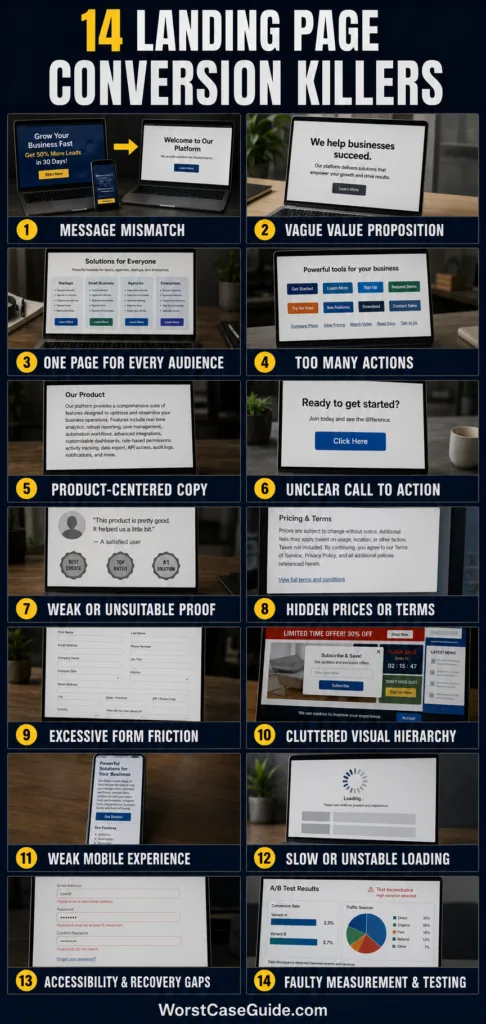
| Mistake | Main Risk | Typical Signal |
|---|---|---|
| 1. Message mismatch | Immediate doubt | High exits from campaign traffic |
| 2. Vague value proposition | Offer is not understood | Short visits and little scrolling |
| 3. One page for every audience | Low relevance | Uneven results between traffic sources |
| 4. Competing actions | Decision paralysis | Clicks spread across unrelated links |
| 5. Product-centered copy | Benefits remain unclear | Feature sections receive little engagement |
| 6. Uncertain call to action | Fear of the next step | Visitors reach buttons but do not click |
| 7. Weak or unsuitable proof | Claims lack credibility | Interest without completion |
| 8. Hidden conditions | Late-stage distrust | Checkout or registration abandonment |
| 9. Excessive form friction | Submission failure | Many form starts but few completions |
| 10. Cluttered hierarchy | Important content is missed | Erratic scrolling and scattered clicks |
| 11. Weak mobile experience | Interaction becomes difficult | Mobile trails desktop performance |
| 12. Slow or unstable loading | Visitors leave before deciding | Early exits on slower devices or networks |
| 13. Accessibility and recovery gaps | People cannot complete the task | Repeated errors and abandoned sessions |
| 14. Faulty measurement and testing | Wrong changes are rewarded | Conflicting reports and unstable results |
Mistake 1: Breaking the Promise Made Before the Click
Why it happens: Advertisements, emails, search snippets, and landing pages are often written by different people. The campaign may promote a specific discount or outcome while the page opens with a broad company message.
Early warning signs: Campaign visitors leave quickly, branded traffic performs much better than paid traffic, or users search the page for wording that appeared in the advertisement.
Worst-case outcome: The visitor suspects that the offer is unavailable, exaggerated, or attached to undisclosed conditions. Advertising costs continue while the page records visits instead of useful actions.
Safer approach: The opening section can repeat the same offer, audience, outcome, and conditions presented before the click. Separate pages may be more suitable when campaigns make materially different promises.
Mistake 2: Using a Vague Value Proposition
Why it happens: Broad phrases such as “better solutions” or “next-generation results” feel flexible, but they do not explain what is offered, who it serves, or why it is useful.
Early warning signs: Test readers cannot describe the offer after viewing the first screen, the headline could belong to many competitors, or visitors scroll before they understand the product category.
Worst-case outcome: Suitable prospects leave because they cannot recognise that the offer applies to them. The business may then interpret the low response as weak demand.
Safer approach: A clearer opening usually identifies the offer, intended user, practical outcome, and meaningful distinction. Specificity matters more than clever wording.
Mistake 3: Sending Every Audience to the Same Page
Why it happens: Maintaining one page is convenient. Yet a first-time buyer, returning customer, procurement manager, and small-business owner may need very different information before acting.
Early warning signs: Conversion rates vary sharply by keyword or channel, the copy relies on phrases such as “for everyone,” or the page contains several unrelated use cases competing for attention.
Worst-case outcome: The page becomes generic enough to avoid excluding anyone but relevant to almost no one. Qualified visitors struggle to find evidence that matches their situation.
Safer approach: In smaller campaigns, one page may work when traffic shares the same intent. In larger systems, segment-specific pages can address different needs while preserving the same offer and brand standards.
Mistake 4: Presenting Too Many Competing Actions
Why it happens: Teams try to give every visitor an option. Navigation menus, newsletter forms, social links, chat prompts, downloads, and purchase buttons all appear on one screen.
Early warning signs: Clicks are distributed across low-value links, multiple buttons use equal visual emphasis, or different sections ask for unrelated actions.
Worst-case outcome: Visitors postpone the decision or leave the conversion path. The page may appear active in analytics while producing few completed goals.
Safer approach: One primary conversion goal can be repeated where it is contextually useful. A secondary action may still make sense for visitors who are not ready, provided it does not compete visually with the main path.
Mistake 5: Writing About the Product Instead of the Decision
Why it happens: Internal teams know the product through its features, technology, and terminology. Visitors usually approach it through a task, cost, concern, or desired result.
Early warning signs: Copy contains many feature names but few use cases, headings resemble an internal presentation, or readers need several paragraphs to understand why a feature matters.
Worst-case outcome: Visitors understand what the product contains but not why they should choose it. Interest remains passive and the decision is delayed.
Safer approach: Features can be connected to observable outcomes, suitable situations, limitations, and trade-offs. For complex purchases, decision-supporting detail may be more persuasive than short promotional copy.
Mistake 6: Making the Call to Action Uncertain
Why it happens: Generic labels such as “Submit,” “Continue,” or “Get Started” are easy to reuse. They say little about what occurs after the click.
Early warning signs: Visitors reach the call-to-action area but hesitate, support questions focus on what happens next, or the button label does not match the surrounding offer.
Worst-case outcome: A low-commitment action is mistaken for an immediate purchase, sales call, or recurring subscription. Visitors leave to avoid an unknown commitment.
Safer approach: The button and nearby text can describe the expected action, such as requesting a quotation, viewing available times, or creating a free account. Any next step that involves contact, payment, or account creation is safer when disclosed before the click.
Mistake 7: Using Weak, Unverifiable, or Misplaced Proof
Why it happens: Testimonials and badges are added because landing pages are expected to contain them, even when the material is anonymous, outdated, unrelated, or difficult to verify.
Early warning signs: Testimonials use only initials, claims have no context, ratings lack a stated source, or proof appears far from the claim it is meant to support.
Worst-case outcome: Evidence intended to build confidence creates suspicion instead. Unsupported claims may also expose the business to complaints or platform review.
Safer approach: Proof is more useful when it is specific, authentic, current, and relevant to the visitor’s concern. A modest customer example with clear context may carry more weight than an impressive but unexplained number.
Mistake 8: Hiding Prices, Conditions, or Commitment
Why it happens: Teams may fear that pricing, eligibility rules, renewal terms, delivery limits, or data-use details will reduce submissions.
Early warning signs: Abandonment rises near checkout, leads repeatedly ask the same price question, or promotional wording depends on qualifiers that appear only at the bottom of the page.
Worst-case outcome: The page generates more initial actions but fewer completed purchases and more dissatisfied leads. Trust falls when the actual commitment appears late.
Safer approach: Material conditions can appear near the relevant claim or action. If exact pricing depends on scope, a range, starting point, or explanation of how pricing is calculated may reduce uncertainty without pretending that every case is identical.
Mistake 9: Asking Too Much From the Form
Why it happens: Marketing, sales, operations, and analytics teams each add fields for their own needs. The form gradually becomes an internal data-collection tool rather than a reasonable exchange for the offer.
Early warning signs: Many users start but do not finish, optional questions feel mandatory, mobile keyboards cover fields, or error messages appear only after submission.
Worst-case outcome: Qualified prospects abandon the page or enter inaccurate information simply to proceed. Sensitive questions asked too early can also damage trust.
Safer approach: The form can request information needed for the immediate next step and explain why unusual data is required. Longer forms may be reasonable for high-value or carefully qualified services, but the expected benefit should justify the effort.
Mistake 10: Letting Visual Clutter Control the Page
Why it happens: New sections are added after meetings, feedback rounds, and campaign changes. Few elements are removed, so banners, icons, animations, pop-ups, and repeated claims compete for attention.
Early warning signs: Several elements appear equally prominent, headings do not tell a coherent story when read alone, or visitors click decorative items that have no conversion role.
Worst-case outcome: The offer, evidence, and next action disappear inside visual noise. Visitors spend effort interpreting the interface instead of evaluating the offer.
Safer approach: A useful hierarchy gives priority to the offer, supporting evidence, objections, and action. Whitespace and restrained emphasis can make the decision path easier to scan without making the page empty or overly minimal.
Mistake 11: Treating Mobile as a Smaller Desktop Page
Why it happens: A responsive template may rearrange content automatically, but it cannot judge tap comfort, keyboard behaviour, content order, sticky elements, or the amount of text visible on a small screen.
Early warning signs: Mobile visitors convert less often, buttons sit too close together, forms require repeated zooming, or chat widgets cover important controls.
Worst-case outcome: A large share of otherwise relevant visitors cannot complete the action comfortably. Campaign averages hide the problem because desktop results partly compensate for mobile losses.
Safer approach: Mobile evaluation can include real devices, common screen sizes, touch input, slow connections, virtual keyboards, and both portrait and landscape orientation. Content order may need adjustment rather than simple shrinking.
Mistake 12: Accepting Slow or Unstable Loading
Why it happens: Large images, video backgrounds, analytics tags, advertising scripts, consent tools, custom fonts, and page builders add weight gradually. Fast office connections can conceal the effect.
Early warning signs: The main content appears late, buttons move while loading, taps do not respond promptly, or slower devices show much higher early-exit rates.
Worst-case outcome: Visitors leave before the offer becomes usable, while analytics may still count part of that traffic. Accidental clicks can occur when content shifts under a person’s finger.
Safer approach: Performance work can prioritise the first visible content and the primary action. Images, scripts, fonts, consent interfaces, and third-party tools are worth evaluating according to the user value they add.
Mistake 13: Ignoring Accessibility and Error Recovery
Why it happens: Teams test the ideal path with a mouse, a familiar device, and correctly entered information. Keyboard navigation, zoom, screen readers, low vision, failed payments, and interrupted connections receive less attention.
Early warning signs: Focus indicators are missing, labels rely only on placeholders, contrast is weak, errors are identified only by colour, or failed submissions erase completed fields.
Worst-case outcome: Some visitors cannot understand or complete the conversion path. Others abandon it after an error because the page does not explain what happened or preserve their work.
Safer approach: Semantic labels, visible keyboard focus, readable contrast, descriptive error messages, and preserved form entries make recovery possible. These measures also help visitors dealing with glare, fatigue, small screens, or temporary connection problems.
Mistake 14: Measuring the Wrong Event or Trusting Tests Too Early
Why it happens: A button click is easier to track than a qualified lead, completed purchase, attended appointment, or retained customer. Testing tools also make it tempting to declare a winner after a short-lived change.
Early warning signs: Analytics platforms report different totals, duplicate conversions appear after page refreshes, test results swing from day to day, or higher submission rates produce weaker leads.
Worst-case outcome: The team rewards a page that creates more clicks but less business value. Repeated changes based on unstable evidence can make performance harder to interpret.
Safer approach: Measurement can connect page interactions with completed outcomes and lead quality. Tests are more dependable when they begin with a stated hypothesis, run across representative traffic, account for campaign changes, and avoid repeated early decisions based on temporary movement.
Reading the Failure Pattern Before Changing the Page
Not every weak conversion rate has the same cause. The location of the drop-off provides a more useful starting point than changing several page elements at once.
| Observed Pattern | Possible Causes | Useful Check |
|---|---|---|
| Visitors leave almost immediately | Message mismatch, vague headline, slow loading, wrong traffic | Compare the traffic promise with the first visible screen |
| Visitors scroll but rarely click | Weak offer, unsuitable proof, unclear CTA, unresolved objections | Review scroll depth alongside clicks and session recordings |
| Visitors click but do not start the form | Unexpected commitment, hidden terms, intrusive data request | Check what becomes visible after the click |
| Visitors start but abandon the form | Too many fields, poor validation, mobile input problems | Measure completion by field and device type |
| Submissions rise but sales do not | Weak qualification, misleading promise, faulty conversion event | Connect page data with later lead or order outcomes |
| Mobile performs far below desktop | Layout, speed, keyboard, tap, or overlay problems | Complete the full journey on several real mobile devices |
Interpretation note: A high bounce rate does not prove that the headline is weak, and form abandonment does not automatically prove that the form is too long. Traffic quality, device mix, technical errors, and offer intent can produce similar patterns.
Risk Patterns Shared by Low-Converting Pages
Clarity Problems Appear Before Persuasion Problems
A visitor cannot evaluate an offer that remains unclear. Pages often add more testimonials, copy, or visual emphasis when the earlier problem is that the person does not yet understand what is being offered and what happens next.
Friction Depends on Context
A long form may be unreasonable for a simple download but acceptable for a tailored business proposal. A visible price may help a straightforward purchase while a customised service may need a range and explanation. Friction should be judged against the visitor’s intent and the value of the next step.
Trust Is Lost Through Inconsistency
A polished testimonial section cannot fully repair conflicting prices, vague conditions, broken controls, or an advertisement that promises something different. Trust grows when claims, evidence, interaction, and follow-up all tell the same story.
Page Metrics Need Business Context
Conversion rate alone can reward the wrong behaviour. A useful assessment may also consider lead quality, order value, completion time, cancellations, refunds, sales acceptance, and customer support burden.
Frequently Asked Questions
What is the most common landing page mistake?
A mismatch between visitor expectation and the first visible message is one of the most common problems. When the page does not quickly confirm the offer that produced the click, visitors may leave before considering the remaining content.
How can a business tell whether the landing page or traffic is the problem?
Results can be compared by source, campaign, keyword, device, and audience segment. If similarly qualified traffic behaves differently across pages, the page may be contributing to the loss. If all pages receive poorly matched visitors, targeting or campaign messaging may be the larger issue.
Should a landing page remove its navigation menu?
Removing or reducing navigation may help when the page supports one focused campaign goal. Navigation can still be useful when visitors need to evaluate complex services, verify company information, or compare several suitable paths. The decision depends on intent rather than a universal rule.
How many calls to action should a landing page have?
A page can repeat the same primary action in several locations without creating several competing goals. A secondary action may serve visitors who need more information, as long as its purpose and visual priority remain distinct.
Does a shorter landing page convert better?
Length alone does not determine performance. A simple, familiar offer may require little explanation. A costly, unfamiliar, or high-commitment decision may need more evidence, conditions, comparisons, and objection handling.
Which landing page metrics are useful beyond conversion rate?
Useful measures may include message-specific bounce rate, scroll depth, CTA clicks, form starts, field errors, completion rate, device performance, qualified-lead rate, completed purchases, cancellations, and later customer value.
Can social proof reduce conversions?
Yes. Anonymous, exaggerated, irrelevant, or visually suspicious proof can create doubt. Evidence is more helpful when it is authentic, specific, current, and placed near the claim or concern it supports.
When should separate landing pages be created?
Separate pages may be suitable when audiences arrive with different problems, offers, locations, levels of awareness, or purchase conditions. Minor wording differences alone may not justify the maintenance and measurement burden of several pages.