A shopper can compare products for twenty minutes, accept the price, add an item to the cart and still leave within seconds of reaching checkout. The decision often changes because the checkout introduces unexpected costs, uncertainty or unnecessary effort at the exact moment when the shopper is ready to commit.
Cart abandonment and checkout abandonment are related but not identical. A cart may be used as a temporary wish list. Checkout abandonment is more revealing because the shopper has already started entering delivery, contact or payment information.
A weak checkout rarely fails because of one dramatic defect. More often, several small points of friction accumulate: a vague delivery date, a required account, an invalid coupon message and a payment form that loses entered data. Each interruption gives the shopper another reason to reconsider.
Useful distinction: A low order-completion rate does not automatically identify a checkout problem. Traffic quality, product availability, shipping regions, device type and payment failures may also affect the result. The checkout should be examined step by step.
Why Checkout Problems Carry More Risk
Checkout sits between purchase intent and payment confirmation. Changes made here can affect conversion rate, customer support volume, payment authorization, delivery accuracy and repeat-purchase behavior at the same time.
- A confusing field can produce invalid addresses and delayed deliveries.
- A slow payment step can create duplicate clicks or uncertain order status.
- An unexpected fee can weaken price trust.
- A missing payment method can block otherwise willing customers.
- An inaccessible control can make checkout unusable for keyboard or screen-reader users.
The checkout is also where shoppers disclose their most sensitive order information. Even when a store uses a secure payment processor, unclear wording or an unfamiliar redirect may make the process feel uncertain. Perception matters here.
Common Checkout Assumptions That Often Fail
- “Interested shoppers will finish anyway.” Purchase intent can be strong without being unconditional.
- “More fields produce better customer data.” Extra data may carry a measurable completion cost.
- “Desktop testing covers mobile checkout.” Touch input, autofill, virtual keyboards and mobile wallets create different conditions.
- “A secure checkout automatically looks trustworthy.” Technical security and customer confidence are separate concerns.
- “One overall abandonment rate explains the problem.” Aggregated data can hide a failure limited to one browser, country, payment method or device class.
- “A successful test order proves the flow works.” Declined cards, expired sessions, address corrections and interrupted redirects require separate testing.
The 13 Checkout Mistakes and Their Warning Signs
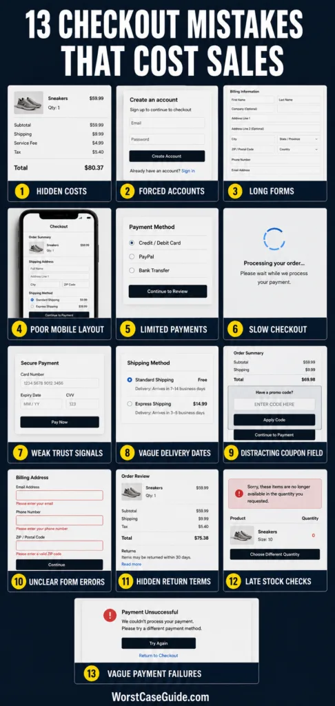
| Checkout Mistake | Early Warning Sign | Possible Outcome |
|---|---|---|
| Hidden costs | Exits rise after the order total appears | Price trust is lost |
| Forced account creation | Drop-off at sign-in or registration | First-time buyers leave |
| Long or unclear forms | Repeated corrections and field exits | Form fatigue and invalid data |
| Poor mobile design | Mobile completion trails desktop | Touch and keyboard obstacles block orders |
| Limited payment methods | Payment-step exits vary by market | Customers cannot use a preferred method |
| Slow or unstable checkout | Long step times and repeated clicks | Timeouts, duplicate attempts or lost sessions |
| Weak trust presentation | Exits increase when payment details are requested | Customers hesitate to submit information |
| Vague delivery information | Shipping-step exits or support questions | Customers postpone the purchase |
| Distracting coupon fields | Customers leave checkout to search for codes | The buying session is interrupted |
| Poor validation | Repeated errors on the same fields | Customers cannot identify the correction |
| Unclear policies | Policy searches occur late in checkout | Commitment feels uncertain |
| Late inventory or eligibility checks | Failures appear near payment | Completed work is discarded |
| Unclear failure recovery | Multiple payment attempts and support contacts | Duplicate-order fear or abandoned payment |
Mistake 1: Revealing Extra Costs Too Late
Why It Happens
Product pages often emphasize the item price while taxes, shipping charges, handling fees or minimum-order conditions appear only after an address is entered. Sometimes the system genuinely needs a location before calculating the final amount. The mistake is allowing the shopper to form an unrealistic price expectation before that calculation.
Early Warning Signs
- Checkout exits rise immediately after shipping costs are displayed.
- Customers return to the cart after viewing the final total.
- Support messages ask why the advertised and payable amounts differ.
- Abandonment is higher in regions with costly delivery.
Worst-Case Outcome
The shopper may interpret the added charge as a pricing tactic rather than a calculation requirement. That reaction can affect more than the current order; it can reduce trust in future prices across the store.
A Safer Approach
Estimated shipping ranges, free-shipping thresholds and known fees can be disclosed before checkout. If the exact amount depends on the address, the interface can say so plainly. In stores with varied delivery regions, a postal-code estimator may help shoppers understand the likely total earlier.
Mistake 2: Requiring an Account Before Purchase
Why It Happens
Accounts help stores retain order history, support loyalty features and simplify later purchases. Problems begin when registration becomes a gate. A first-time customer may not want another password, marketing relationship or profile before knowing whether the order can even be completed.
Early Warning Signs
- A large share of sessions ends on the login page.
- Password-reset activity appears during checkout.
- New visitors abandon more often than returning customers.
- Shoppers create accounts but do not reach payment.
Worst-Case Outcome
A customer who was ready to pay becomes trapped in an account-recovery or verification process. The purchase task turns into an administrative task, and the original buying intent fades.
A Safer Approach
Guest checkout can remain visible alongside sign-in. Account creation may be offered after purchase, when the store already has much of the required information. If accounts are necessary for a particular service, the reason can be explained before the shopper enters the flow.
Mistake 3: Asking for Too Much Information
Why It Happens
Checkout forms tend to grow slowly. Marketing requests a phone number, operations adds delivery instructions, analytics adds a survey and the account system requests a password. Each addition may look harmless by itself. Together, they create a form that feels unrelated to the purchase.
Early Warning Signs
- Optional fields receive little useful data.
- Users pause or exit around phone, date-of-birth or account fields.
- Form completion time is unexpectedly long.
- Placeholder data such as repeated digits appears in required fields.
Worst-Case Outcome
Customers may abandon the form or submit inaccurate information simply to proceed. Operations then receives data that looks complete but cannot be trusted.
A Safer Approach
Each field can be tied to a clear order need. Optional fields should be visibly optional, and billing-address controls can avoid duplicating the shipping form when both addresses match. Address autocomplete and browser autofill may reduce typing, provided manual entry remains available.
Mistake 4: Treating Mobile Checkout as a Smaller Desktop Page
Why It Happens
A layout can technically fit a phone screen and still be difficult to use. Small tap targets, obscured buttons, unsuitable keyboard types and fields hidden behind the virtual keyboard create friction that desktop testing will not reveal.
Early Warning Signs
- Mobile checkout completion is much lower than desktop completion.
- Users repeatedly zoom, scroll sideways or reopen fields.
- The payment button receives several taps.
- Drop-off rises on devices with smaller screens.
Worst-Case Outcome
The customer cannot see an error, close a keyboard or reach the final button. Checkout is not merely inconvenient in that scenario. It is functionally blocked.
A Safer Approach
Mobile testing can include real devices, autofill, screen rotation, slower connections and different virtual keyboards. Labels should remain visible after typing. Touch controls need adequate space, while the order total and primary action should remain easy to identify without covering form content.
Mistake 5: Offering Payment Methods That Do Not Match the Customer
Why It Happens
A store may choose payment methods according to its internal setup rather than customer habits. Card-only checkout can be acceptable in one market but restrictive in another. Mobile shoppers may also expect a wallet that avoids manual card entry (a habit reinforced by marketplace apps).
Early Warning Signs
- Abandonment rises only after available payment methods appear.
- Customers ask whether a local wallet or another method is accepted.
- Completion differs sharply by country or device.
- Card-entry abandonment is high among mobile visitors.
Worst-Case Outcome
The shopper has funds and purchase intent but no practical way to pay. Adding more methods without analysis can create another problem: a crowded payment page that is harder to understand and maintain.
A Safer Approach
Payment options can be selected using customer location, device data, processor reliability and support capacity. Familiar methods may appear first, while less-used choices can remain available without dominating the page. Method-specific fees or restrictions should appear before selection.
Mistake 6: Allowing Checkout Pages to Become Slow or Unstable
Why It Happens
Checkout may depend on tax services, address tools, inventory systems, analytics scripts, fraud checks and payment gateways. A delay in any dependency can hold up the page. Third-party scripts can also compete for processing time on lower-powered phones.
Early Warning Signs
- Step-loading time varies widely between sessions.
- Customers click the payment button more than once.
- Sessions expire while the shopper is entering information.
- JavaScript errors or gateway timeouts cluster around checkout.
Worst-Case Outcome
A customer sees a spinner after payment and cannot tell whether the order succeeded. They may retry, contact support or leave with concern about a duplicate charge. Uncertainty is the real damage.
A Safer Approach
Checkout performance can be monitored separately from general site speed. The payment action should show a clear processing state and resist accidental repeat submission. Nonessential scripts may be delayed, and dependency failures should produce a usable message rather than an empty page.
Mistake 7: Using Trust Signals Poorly
Why It Happens
Some checkouts provide almost no context when requesting payment information. Others fill the page with badges, claims and visual warnings. Both approaches can make the payment step feel unfamiliar or over-defensive.
Early Warning Signs
- Exits rise when card details are requested.
- The checkout uses a different domain, design or tone without explanation.
- Security graphics distract from the payment fields.
- Customers ask whether the payment page is genuine.
Worst-Case Outcome
A legitimate payment flow resembles a suspicious one. The shopper may leave, especially if an unexpected redirect or inconsistent store identity appears at the same moment.
A Safer Approach
Consistent branding, clear payment-processor transitions, accessible contact information and plain explanations usually communicate more than a wall of badges. Trust claims should be accurate and verifiable. The page can also explain why unusual information is requested.
Mistake 8: Hiding Delivery Timing Until the Final Step
Why It Happens
Stores sometimes display shipping labels such as “standard” or “express” without an estimated arrival date. Yet the customer may be buying for a birthday, trip, replacement need or another fixed deadline. Shipping speed alone does not answer the practical question: When might the order arrive?
Early Warning Signs
- Customers leave the checkout to visit shipping-information pages.
- Support receives repeated pre-purchase delivery questions.
- Express-shipping selections are followed by abandonment.
- Delivery complaints mention unclear expectations.
Worst-Case Outcome
The shopper either abandons a purchase that could have arrived on time or places an order based on the wrong assumption. The second outcome creates cancellation requests, returns and avoidable support work.
A Safer Approach
Estimated dispatch and arrival ranges can appear before payment, with clear wording when dates are not guaranteed. Store-processing time should not be hidden inside the carrier estimate. For split shipments or back-ordered products, item-level timing may be clearer than one date for the whole cart.
Mistake 9: Turning the Coupon Field Into an Exit Door
Why It Happens
A large “Promo Code” field suggests that a discount is available and the shopper may be overpaying without it. The customer leaves checkout to search email, social platforms or coupon sites. Once the session is interrupted, competing offers and expired codes enter the decision.
Early Warning Signs
- External navigation increases after the coupon field becomes visible.
- Many invalid or expired codes are submitted.
- Customers repeatedly edit the cart after code rejection.
- Support contacts focus on discount eligibility.
Worst-Case Outcome
A customer who accepted the original price now feels they are receiving a worse deal than other buyers. The sale is lost even though the product price itself did not change.
A Safer Approach
The coupon control can remain available without dominating checkout, perhaps behind a clearly labeled expandable section. Applied discounts should be visible in the order total. Rejected codes need a specific explanation, such as expiration, minimum spend or product exclusion, where the store can state it accurately.
Mistake 10: Showing Errors Without Explaining How to Recover
Why It Happens
Generic messages such as “Invalid input” are easy for systems to produce but difficult for people to resolve. Errors may also appear only at the top of a long page, after submission, while the affected field remains out of view.
Early Warning Signs
- The same field fails several times in one session.
- Users erase correct information while searching for the problem.
- Form submission fails without focus moving to the error.
- Screen-reader or keyboard testing cannot locate validation feedback.
Worst-Case Outcome
The shopper cannot distinguish a formatting issue from a system failure. Repeated correction attempts then become guesswork, and checkout reaches a dead end.
A Safer Approach
Validation messages can identify the field, describe the issue and preserve all unaffected entries. Inline feedback should remain available to assistive technology and should not rely on color alone. Flexible input handling can accept common spacing and punctuation differences where the underlying data permits them.
Mistake 11: Leaving Returns and Purchase Terms Unclear
Why It Happens
Policy information is often placed in a footer or written for every possible case at once. A shopper buying a sized, fragile, personalized or final-sale product may need a direct answer before paying. A generic policy label does not always resolve product-specific uncertainty.
Early Warning Signs
- Shoppers leave checkout for return or cancellation pages.
- Pre-purchase questions focus on eligibility and return costs.
- Customers abandon products with special conditions more often.
- Post-purchase disputes refer to conditions that were difficult to find.
Worst-Case Outcome
The shopper postpones the purchase because the cost of making the wrong choice is unclear. If they proceed under a mistaken assumption, the same ambiguity can later produce dissatisfaction and support disputes.
A Safer Approach
Short, product-relevant policy information can appear near the order review, with access to the full terms. Final-sale status, personalization limits, return windows and known return costs should not emerge only after payment. Wording needs to match the store’s actual process.
Mistake 12: Checking Inventory and Order Eligibility Too Late
Why It Happens
Inventory, delivery coverage, quantity limits and restricted product combinations may be validated by separate systems. When these checks occur only after the shopper completes every field, the checkout accepts effort before confirming that the order is possible.
Early Warning Signs
- Out-of-stock messages appear near payment.
- Addresses are rejected only after delivery details are completed.
- Cart contents change unexpectedly during checkout.
- Customers repeatedly return to edit quantities or product combinations.
Worst-Case Outcome
The customer spends several minutes completing checkout and then learns that the order cannot be fulfilled. Even a suitable substitute may be rejected because confidence in the inventory information has already weakened.
A Safer Approach
Inventory and basic delivery eligibility can be checked as early as the system allows, then checked again before payment. If availability changes, the message should identify the affected item, preserve the remaining cart and present realistic options. Silent item removal creates more confusion.
Mistake 13: Failing to Clarify What Happened After a Payment Error
Why It Happens
Payment failures can originate from incorrect details, authorization declines, authentication steps, network interruptions or processor timeouts. A generic “Payment failed” message treats these different events as though they require the same response.
Early Warning Signs
- Customers submit the same payment several times.
- Support receives “Was I charged?” questions.
- Orders remain in uncertain or pending states.
- Customers restart checkout after an authentication redirect.
Worst-Case Outcome
The shopper cannot tell whether retrying might create a duplicate order. They may stop the purchase entirely or make repeated attempts that complicate payment reconciliation and customer support.
A Safer Approach
Failure messages can explain whether an order was created, whether payment remains pending and what options are available next. Entered shipping information should survive a retry. Where the processor cannot provide a definite status immediately, the page can acknowledge that uncertainty instead of presenting an inaccurate failure or success message.
Risk Patterns That Connect These Mistakes
Uncertainty Is Often More Damaging Than Effort
A shopper may tolerate several fields when they understand why the information is needed. A single unexplained fee or ambiguous payment status can be more disruptive. Checkout optimization is therefore not only about reducing clicks. It is also about reducing unanswered questions.
Late Surprises Carry a Higher Cost
Shipping restrictions, additional fees and product conditions become more frustrating after the customer has invested time. The closer a surprise appears to payment, the more it can feel like the finish line has moved.
Aggregated Metrics Hide Local Failures
An overall checkout completion rate may look stable while one browser version, region or payment method is failing. Useful analysis can segment checkout behavior by device, traffic source, customer type, market, payment option and checkout step.
Step-level events can reveal where shoppers pause, correct fields, return to the cart or encounter an error. These observations are more actionable than treating every incomplete checkout as the same event.
Successful Orders Do Not Cover Failure Scenarios
A normal test order follows the clean path. Real customers arrive with expired sessions, declined payments, unusual addresses, disabled autofill, slow connections and carts that change during checkout. Testing those conditions can expose recovery problems that a standard purchase never touches.
Fewer Steps Do Not Always Mean Less Friction
A one-page checkout can feel overwhelming if every field appears at once. A multi-step checkout can feel calm when progress, totals and navigation are clear. The relevant question is not simply how many pages exist. It is whether each stage asks for an understandable amount of work and preserves the shopper’s progress.
A practical measurement view: Checkout completion, field-error frequency, payment authorization results, step duration and recovery success describe different parts of the experience. Reading them together provides a clearer picture than one abandonment percentage.
Frequently Asked Questions
What is the difference between cart abandonment and checkout abandonment?
Cart abandonment includes visitors who add products but never begin checkout. Some may be comparing items or saving them for later. Checkout abandonment refers to shoppers who start the purchase process but leave before completing the order, making it more closely connected to checkout friction.
Which checkout mistake is most likely to cause abandonment?
The answer varies by store and customer group. Unexpected costs, forced registration, payment limitations and unclear delivery timing are common causes, but step-level analytics and customer feedback are needed to identify the dominant problem in a particular checkout.
Does guest checkout always improve order completion?
Guest checkout often removes account-related friction for first-time customers. It may have less effect when accounts are naturally required for subscriptions, memberships or managed services. In those situations, explaining the requirement early can reduce surprise.
Is a one-page checkout better than a multi-step checkout?
Neither format is automatically better. A one-page flow may work well for short forms, while a clearly organized multi-step flow may be easier for complex orders. Mobile usability, progress visibility, form length and error recovery usually matter more than the page count alone.
How can a store identify where customers leave checkout?
Step-level analytics can track movement from cart review through contact, delivery, payment and confirmation. Field errors, page timing, device segments, payment results and session recordings with sensitive information protected can add context to the exit rate.
Can too many payment methods hurt checkout usability?
Yes. Extra methods can create visual clutter, maintenance work and inconsistent failure behavior when they are added without customer demand. Relevant options can be prioritized by market and device while less-used methods remain secondary.
Why do customers abandon checkout after a payment error?
They may not know whether the payment was declined, still processing or already accepted. A lost form, vague message or fear of duplicate payment adds further friction. Clear status information and preserved checkout data make recovery easier.