A visitor who reaches a form has already crossed several barriers: finding the page, understanding the offer, and deciding that taking action may be worthwhile. Form design can either preserve that intent or slowly drain it away. A field that feels unnecessary, an unclear error, or a mobile keyboard that fights the expected input may be enough to interrupt completion. The problem is rarely one dramatic defect. More often, several small points of friction accumulate until submitting no longer feels worth the effort.
This applies to contact forms, quote requests, newsletter sign-ups, registrations, lead forms, booking forms, surveys, applications, and checkout flows. The form is the final handoff between interest and action. When that handoff requires guessing, unnecessary work, or repeated corrections, submission rates can suffer.
Why Form Friction Is Easy to Underestimate
Form problems often look harmless during an internal review. A team already knows what every field means, why certain information is requested, and what should happen after clicking the button. A first-time visitor does not have that context.
A short hesitation can matter. The visitor may wonder whether a phone number is really required, whether an error erased earlier answers, or whether clicking “Continue” will submit the form or open another step. Each uncertainty adds interaction cost.
A useful way to assess a form: look beyond the number of fields. Consider how much reading, interpretation, typing, correction, scrolling, and decision-making the visitor must perform before the form accepts the submission.
Common Assumptions That Create Weak Forms
- “Visitors will understand what this field means.”
- “More information is always better for the business.”
- “A shorter-looking two-column form feels easier.”
- “Everyone knows an asterisk means required.”
- “Placeholder text is enough to identify a field.”
- “If someone really wants to submit, they will fix any errors.”
- “Desktop testing is enough because the form is responsive.”
- “The submit button text does not matter.”
Those assumptions put the burden on the visitor. Better form design reduces the amount of interpretation required before each action.
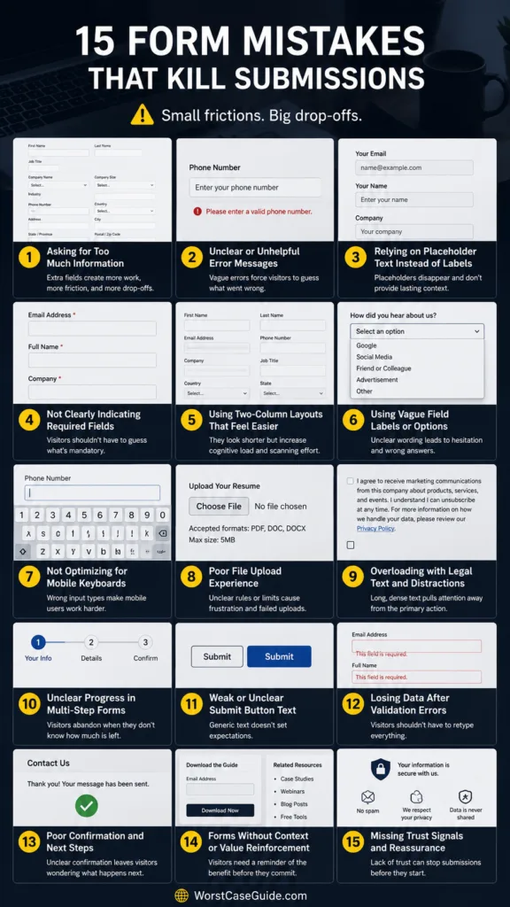
Mistake 1: Asking for More Information Than the Task Needs
Every additional field creates another decision and another chance for the visitor to stop. Long forms can be appropriate when the process genuinely requires detailed information, but unnecessary fields make even simple requests feel larger than they are.
Why It Happens
Marketing, sales, support, and operations may each request extra data. Individually, every field seems useful. Together, they can turn a simple contact request into something resembling an application.
Early Warning Signs
- Visitors must provide information that will not be used immediately.
- Several fields are marked optional but remain permanently visible.
- A basic enquiry requires company size, job title, phone number, location, and other profile data.
- People frequently abandon the form after starting it.
Worst-Case Result
A visitor with genuine interest decides that the form demands too much effort for the expected benefit and leaves without making contact.
A Safer Approach
The first submission can collect only what is needed for the next step. Additional information can sometimes be requested later, once a relationship or transaction already exists. Useful data is not automatically useful form data.
Mistake 2: Requesting Personal Information Without Explaining Why
A phone number, date of birth, address, or company information may be reasonable in one form and puzzling in another. When the connection between the field and the task is unclear, visitors may hesitate.
Why It Happens
The business knows how the information will be used, so the reason feels obvious internally. The visitor sees only another request for personal data.
Early Warning Signs
- Contact forms require a telephone number even when email is sufficient.
- Sensitive-looking fields have no nearby explanation.
- Optional personal fields visually appear mandatory.
Worst-Case Result
The visitor begins questioning what will happen after submission and chooses not to continue.
A Safer Approach
If a less-obvious field is genuinely needed, short supporting text can explain its purpose. A sentence such as “Used only to contact you about this booking” removes a question that would otherwise remain unanswered.
Mistake 3: Using Placeholder Text as the Only Field Label
Placeholder-only forms can look clean while empty. The problem appears once typing begins: the description disappears, leaving the entered value without its original context.
Why It Happens
Removing visible labels reduces visual clutter and makes the form appear shorter. That visual simplicity can create functional confusion.
Early Warning Signs
- Labels disappear when a field receives input.
- Filled fields become difficult to review quickly.
- Similar entries such as first name, last name, username, or company name become hard to distinguish.
Worst-Case Result
Someone notices an error but cannot immediately remember what a field represents. Correcting the form then requires extra checking or deleting existing input.
A Safer Approach
Persistent, descriptive labels usually provide stronger context. Placeholder text can still show an example or expected format, but it does not need to carry the entire meaning of the field.
Mistake 4: Packing Fields Into Multiple Columns
Two or three columns may make a desktop form shorter vertically, yet the reading order becomes less obvious. Should the visitor move across each row or finish the first column before moving to the second?
Why It Happens
Designers sometimes treat page height as the main measure of simplicity. A compact form is not always a faster form.
Early Warning Signs
- Related fields are visually separated.
- The natural tab order does not match the apparent visual order.
- The mobile version rearranges fields in an unexpected sequence.
Worst-Case Result
Visitors overlook a field, enter information in the wrong place, or reach submission with an incomplete form.
A Safer Approach
A single main column provides a predictable downward path for most forms. Closely connected short fields may occasionally share a row, but the overall reading order should remain obvious.
Mistake 5: Making Required and Optional Fields Ambiguous
A visitor should not have to discover which fields are mandatory by pressing submit. Yet forms sometimes mark required fields inconsistently or assume that everyone understands an unexplained symbol.
Why It Happens
The distinction seems obvious during development because the team has seen the form many times.
Early Warning Signs
- Some mandatory fields use an asterisk while others do not.
- Optional fields have no indication that they can be skipped.
- The meaning of the required-field marker appears only far above the form.
Worst-Case Result
A visitor completes what appears necessary, submits, receives several errors, and decides the process requires more effort than expected.
A Safer Approach
Required and optional status can be communicated clearly and consistently in words or with well-explained markers. The visitor should know the expectation before interacting with the field.
Mistake 6: Using Vague Field Names and Instructions
Labels such as “Information,” “Details,” “ID,” or “Number” may make sense inside a particular team while remaining unclear to an outsider. Instructions can fail in the same way when they describe internal terminology instead of the visitor’s task.
Why It Happens
Forms often inherit vocabulary from databases, CRM fields, internal workflows, or older paper forms.
Early Warning Signs
- Visitors regularly ask what a field means.
- Labels require surrounding headings to make sense.
- Formatting rules appear only after an error occurs.
Worst-Case Result
The visitor guesses, submits incorrect information, receives an error, and loses confidence in the process.
A Safer Approach
Labels can describe exactly what belongs in the field. If a value requires a particular format, nearby hint text can communicate that before typing begins.
Mistake 7: Using Rigid Input Rules That Reject Normal Entries
A form can technically validate data and still frustrate real users. Phone numbers, names, postal codes, dates, and addresses appear in many legitimate formats.
Why It Happens
Validation rules are sometimes designed around the database format rather than the way people naturally enter information.
Early Warning Signs
- Spaces or punctuation trigger errors even though they could be normalized automatically.
- Users must manually imitate a hidden formatting rule.
- Legitimate names or addresses are rejected because they do not fit an expected pattern.
Worst-Case Result
A valid visitor cannot satisfy the validator and reaches a dead end.
A Safer Approach
Where the system can safely normalize ordinary variations, accepting natural input reduces unnecessary correction. Restrictions that truly matter can be explained before submission rather than revealed through repeated failure.
Mistake 8: Ignoring Mobile Input Behavior
A form can fit inside a phone screen and still be awkward to complete. Mobile usability includes more than responsive width. Keyboard type, field spacing, zoom behavior, autofill, input visibility, and touch targets all affect the experience.
Why It Happens
Desktop testing often happens first, while mobile testing checks appearance rather than actual completion.
Early Warning Signs
- A phone field opens a general text keyboard.
- Email entry requires unnecessary switching between keyboard layouts.
- Autocorrect alters names or email addresses.
- The on-screen keyboard hides the active field or important controls.
- Checkboxes and radio controls are difficult to tap.
Worst-Case Result
A form that feels simple on a laptop becomes slow and error-prone on the device a visitor is actually using.
A Safer Approach
Mobile testing is more revealing when someone completes the entire form rather than simply viewing it. Appropriate input types, autofill support, readable fields, and comfortable controls can remove many small interruptions.
Mistake 9: Validating Fields at the Wrong Time
Immediate feedback can help, but validation becomes distracting when the form announces an error while the visitor is still typing. Waiting until the very end creates the opposite problem: several errors may appear at once.
Why It Happens
Validation is often treated as a technical requirement rather than part of the interaction.
Early Warning Signs
- An email field displays an error after the first typed character.
- Errors appear before a visitor has finished moving through the field.
- No feedback appears until the entire form has been submitted.
Worst-Case Result
The form feels either impatient or unhelpful. In both cases, correcting mistakes requires more mental effort than necessary.
A Safer Approach
Feedback can usually appear after a person has finished interacting with a field, while final submission still performs a complete check. Successful entries do not need constant visual celebration; useful feedback is enough.
Mistake 10: Showing Generic Error Messages
“Invalid input” identifies a problem without explaining it. The visitor now has a second task: diagnose the form.
Why It Happens
Generic validation messages are easy to reuse across many fields and error conditions.
Early Warning Signs
- Different errors produce the same message.
- An error appears far from the affected field.
- The message says what failed but not what needs changing.
- Color alone identifies the error.
Worst-Case Result
After several failed attempts, the visitor concludes that the form is broken even though the system is behaving exactly as programmed.
A Safer Approach
Error text can identify the affected field, explain the problem in plain language, and indicate what type of correction is expected. For longer forms, an error overview near the beginning can work alongside messages beside individual fields.
Mistake 11: Erasing Entered Data After an Error
Few form problems feel as costly as correcting one mistake and discovering that several correct answers have disappeared.
Why It Happens
The form may reload after server-side validation, lose state between steps, or fail to preserve selections when an error response is returned.
Early Warning Signs
- Dropdown selections reset after submission errors.
- Previously entered text disappears.
- Moving backward in a multi-step form removes earlier answers.
Worst-Case Result
A nearly completed submission turns into a second round of data entry. Some visitors will not repeat the work.
A Safer Approach
When technically and appropriately possible, valid entries can survive validation errors and movement between steps. The visitor then fixes the problem instead of rebuilding the form.
Mistake 12: Making the Main Action Unclear
A button labeled “Continue” might mean submit, proceed to another page, confirm information, create an account, or move to the next question. Visitors should not need to click it to discover which one.
Why It Happens
Generic button labels are easy to reuse. Visual designs can also give secondary actions almost the same prominence as the main submission action.
Early Warning Signs
- The button says only “Go,” “Next,” or “Continue.”
- Submit and cancel actions look equally prominent.
- The visitor cannot tell whether clicking creates an account or merely sends an enquiry.
Worst-Case Result
Uncertainty appears at the exact moment when the visitor is deciding whether to commit.
A Safer Approach
Action labels can describe what happens next: “Send Enquiry,” “Create Account,” “Request Quote,” or “Continue to Review.” Clear wording lowers the amount of guesswork attached to the click.
Mistake 13: Treating Accessibility as Separate From Form Usability
Missing label associations, weak keyboard navigation, unclear focus states, inaccessible error feedback, and tiny controls are often discussed as accessibility defects. They are also form usability defects.
Why It Happens
A form may be reviewed visually with a mouse and never tested using keyboard navigation, zoom, screen-reading software, or alternative input methods.
Early Warning Signs
- Fields have visible text nearby but no properly associated label.
- Keyboard focus becomes difficult to locate.
- Errors depend entirely on color.
- Radio buttons or checkboxes have very small clickable areas.
- Dynamic error messages are visually visible but difficult for assistive technology to detect.
Worst-Case Result
Some visitors encounter a form that is slower or harder to use, while others may be unable to complete it reliably at all.
A Safer Approach
Visible labels, logical keyboard order, clear focus, usable control sizes, meaningful error feedback, and correctly connected form elements improve the interaction for a wider range of visitors.
Mistake 14: Making Long Forms Feel Endless
Some processes cannot realistically fit into four or five fields. Applications, onboarding flows, detailed quotes, and bookings may require many answers. The problem changes from form length to orientation.
Why It Happens
A large process is divided into pages, but the visitor receives little indication of where they are or what remains.
Early Warning Signs
- Every screen uses the same vague “Next” button.
- No progress information appears during a multi-step process.
- Visitors cannot safely return to an earlier step.
- Later steps unexpectedly request information that could have been anticipated earlier.
Worst-Case Result
The visitor reaches the middle of the process without knowing whether two questions or twenty remain and decides not to continue.
A Safer Approach
Long processes can provide orientation through meaningful step names, progress information, sensible grouping, and preserved answers. In smaller forms, introducing several steps may add unnecessary navigation, so the structure depends on the amount and complexity of information being collected.
Mistake 15: Failing to Confirm That Submission Worked
A form is not finished from the visitor’s perspective when the server receives the data. It is finished when the visitor understands that the action succeeded.
Why It Happens
Development effort tends to focus on receiving and storing the submission. The success state becomes an afterthought.
Early Warning Signs
- The form simply disappears after submission.
- A small message appears outside the visitor’s current viewport.
- The button remains active while processing with no status indication.
- Users sometimes submit the same information more than once.
Worst-Case Result
The visitor assumes nothing happened, submits again, leaves uncertain, or contacts the organization through another channel to check whether the first attempt arrived.
A Safer Approach
A clear success state can confirm what happened and, when relevant, explain the next expected step. During processing, visible feedback can also reduce repeated clicks without making the interaction feel complicated.
How These Problems Usually Combine
| Pattern | What the Visitor Experiences | Likely Risk |
|---|---|---|
| Too much requested information | The form feels larger than the task | Abandonment before completion |
| Unclear labels and requirements | Extra interpretation and guessing | Incorrect or incomplete entries |
| Poor validation and errors | Repeated correction attempts | Loss of confidence |
| Weak mobile behavior | Slower typing and more mistakes | Mobile abandonment |
| Lost data after errors | Work must be repeated | Exit near the end of the process |
| Unclear action or success state | Uncertainty about what will happen | Hesitation or duplicate submissions |
A form rarely fails because of one isolated detail. Imagine a visitor on a phone who encounters eight fields, three unexplained optional questions, disappearing labels, and an error that says only “Invalid.” Each issue looks small on its own. Together they form a long series of tiny toll gates.
The reverse is also true. A form does not need elaborate animation or clever interaction to feel easy. Clear questions, reasonable data requests, predictable movement, useful feedback, and preserved input often do more for completion than visual decoration.
Form Risk Patterns Worth Testing Before Publishing
- Effort risk: Does the form ask for more typing or decision-making than the task reasonably requires?
- Clarity risk: Can each field be understood without relying on surrounding context?
- Trust risk: Are unusual personal-information requests explained?
- Error risk: Can someone understand and repair a mistake without losing valid answers?
- Device risk: Does actual completion remain comfortable on a small screen and touch keyboard?
- Accessibility risk: Can controls, instructions, errors, and progress be understood through different interaction methods?
- Commitment risk: Is it clear what the primary button will do?
- Confirmation risk: Does the visitor unmistakably know when submission has succeeded?
Testing becomes more revealing when the reviewer approaches the form without filling gaps from memory. If the person testing already knows what every label means and what every button does, some of the most important friction may remain invisible.
Frequently Asked Questions
Do shorter forms always get more submissions?
Not necessarily. Removing useful fields can create confusion later, while complex processes may legitimately require more information. The better question is whether each field is necessary for the current task and whether the amount of effort feels proportionate to what the visitor expects to receive.
Should every form use a single-column layout?
A single main column provides a predictable reading path for many forms. Closely connected short inputs can sometimes share a row without causing confusion, but extensive multi-column layouts deserve careful testing, particularly on smaller screens.
Are placeholder labels bad for form design?
Placeholder text can be useful for examples or formatting hints. Problems arise when it replaces the persistent label entirely because the field can lose context once typing begins.
When should a long form be split into multiple steps?
Multiple steps can help when the amount of information is genuinely large or naturally divided into stages. A short form may become slower if it is unnecessarily split across several screens. The number of fields, complexity of the questions, and visitor’s need for orientation all matter.
What is one of the most damaging form error behaviors?
Losing valid information after an error creates immediate rework. Preserving completed fields allows the visitor to focus on correcting the actual problem rather than repeating answers that were already accepted.