Layout choices in a home renovation feel visual, but they behave like a system: once walls, plumbing, and wiring move, the cost of changing your mind rises fast. The risk is rarely “disaster.” It is usually avoidable rework, daily friction, and small compromises that compound over years.
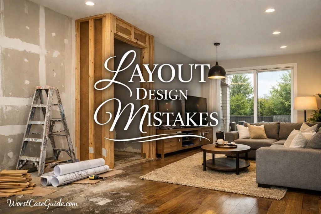
Common Layout Design Mistakes In Home Renovations
Most renovation layout mistakes come from treating a floor plan like a static drawing instead of a moving routine. People cook, carry laundry, host, work, and recover from long days; the layout either supports that flow or quietly fights it with extra steps.

Why Layout Decisions Carry Outsized Risk
Layout is the dependency hub of a renovation. It touches structure, mechanicals (plumbing, HVAC, electrical), finishes, and furniture. A small change in one area can ripple into permits, lead times, and installation sequencing.
If the project is a single-room refresh, a layout mistake often becomes annoyance plus a few unplanned purchases. In larger renovations, the same mistake can trigger schedule slippage, trade conflicts, and tear-outs that no one budgeted for.
Common Wrong Assumptions That Lead To Rework
Low-drama way to think about risk: A layout mistake is usually not “wrong.” It is unsupported—missing a constraint that shows up later as rework or daily friction.
Layout Mistakes That Create Hidden Costs
The mistakes below are written as patterns, not moral failures. If one feels familiar, it usually means the project is missing a checkpoint or a decision dependency.
Mistake 1: Designing For A “Pretty Plan” Instead Of Daily Routes
Plans often optimize for a photo angle or a showroom look, while real life is about paths: fridge to sink, entry to storage, bed to bathroom, laundry to closet.
Why It Happens
It is easy to judge symmetry on paper and hard to picture carrying groceries around a tight pinch point.
Early Warning Signs
Worst-Case Outcome
The home feels busy even when it is clean. Over time, people create workarounds—temporary surfaces, extra carts, awkward furniture—until the layout “works” by clutter.
Safer Approach
A plan tends to hold up better when it is checked against three everyday routes: arriving home, cooking a simple meal, and getting ready in the morning. If a route needs detours, that is a design signal, not a personal failure.
Mistake 2: Skipping An Accurate “As-Built” Measurement Pass
Renovation plans often assume walls are straight and dimensions are consistent. Older homes (and many newer ones) can be subtly off, and those small errors hit cabinet runs and tile layouts.
Why It Happens
There is pressure to “start” and measurement feels like delay. The problem is that missing dimensions often become surprises when materials are already ordered, making change expensive.
Early Warning Signs
Worst-Case Outcome
Misfits show up late: a countertop needs a seam, a door rubs, a fixture lands off-center. The fixes are rarely catastrophic, but they can be visible forever.
Safer Approach
Layouts tend to be more stable when the plan is based on verified dimensions at the points that matter: openings, corners, and long runs. In older homes, planning with tolerance (small buffers) often reduces last-minute improvisation.
Mistake 3: Treating Structure And Mechanicals As “Someone Else’s Problem”
A layout can look perfect until it meets load paths, duct routes, and plumbing stacks. When these constraints arrive late, the layout becomes a negotiation under time pressure.
Why It Happens
Teams often split into silos: design first, then trades. That split hides dependencies until demolition exposes real-world obstacles and code constraints.
Early Warning Signs
Worst-Case Outcome
Late constraint discovery can force layout compromises: soffits appear, ceilings drop, a door moves, or a fixture shifts away from the intended position. The project still finishes, but the result can feel patchworked.
Safer Approach
Layouts usually age better when structural and mechanical constraints are treated like first-class inputs. If the renovation is small, a quick check on what cannot move can prevent late-stage redesign.
Mistake 4: Ignoring Door Swings, Clearances, And “Collision Zones”
On paper, rooms can fit everything. In use, door swings and clearance needs create collisions: doors hit furniture, two people cannot pass, drawers block walkways, and tight corners become daily irritants.
Why It Happens
Clearances can feel like wasted space until they are missing. Many layouts also forget open states—a door, drawer, or appliance always exists in two positions.
Early Warning Signs
Worst-Case Outcome
People adjust by leaving doors half-open, avoiding storage, or moving furniture into less comfortable positions. In cramped bathrooms, the worst-case is inaccessibility: the space becomes hard to use safely for guests or during a temporary injury.
Safer Approach
Collision risks often become visible by checking the open positions of doors, drawers, and appliances on the plan. If the project is larger, marking two-person moments (passing, cooking together) can expose pinch points.
Mistake 5: Underplanning Storage And “Drop Zones”
A home can look minimalist while depending on invisible storage. Without it, the layout becomes clutter-seeking: items land on counters, chairs, and stairs, and the space feels smaller than it is.
Why It Happens
Storage is often treated as a later detail, but it is a layout decision—it needs proximity, depth, and access. If it is missing, the home invents storage in high-visibility areas.
Early Warning Signs
Worst-Case Outcome
Surfaces become permanent storage, which can increase cleaning effort and reduce usable prep space. In some homes, the worst-case is a constant “shuffling” lifestyle where one task requires moving items from place to place.
Safer Approach
Storage planning holds up better when it is tied to arrival, cooking, and laundry routines. A small upgrade (like a thoughtful entry closet) can reduce visual noise more than a large decor change.
Mistake 6: Chasing Open Concept Without Accounting For Sound, Smell, And Sightlines
Open layouts can support togetherness, but they also amplify noise, carry odors, and remove visual boundaries. What feels “airy” on day one can feel exposed in daily life.
Why It Happens
Open concept is often used as a shorthand for modern. The trade-offs are subtle in drawings and obvious only when someone is taking a call, a child is sleeping, or the kitchen is mid-cleanup—situations that create competing needs.
Early Warning Signs
Worst-Case Outcome
The home becomes difficult to use for simultaneous activities: one person cooking, one working, one resting. Some households respond by adding furniture “walls,” which can reduce flow and undermine the original intent.
Safer Approach
Open plans tend to work better when they still provide soft separation: partial walls, pocket doors, or zones that allow privacy on demand. In smaller homes, selective openness often feels calmer than removing every boundary.
Mistake 7: Treating Lighting As A Fixture Choice Instead Of A Layout Layer
Lighting is part of the functional layout. It affects how safe stairs feel, whether the kitchen is usable at night, and whether a room supports focused work or rest without glare. Poor lighting plans make a finished renovation feel unfinished.

Why It Happens
People pick fixtures before they map tasks and switch locations. The result is bright spots in the wrong places, dark corners where work happens, and switches that are not where your hand expects them—small usability costs.
Early Warning Signs
Worst-Case Outcome
People add lamps, extension cords, and workarounds. In the worst-case, lighting creates safety friction on stairs or in bathrooms at night, and the home gains a permanent “dim corner” feeling that no paint color fixes. The cost is rarely huge, but it is persistent and annoying.
Safer Approach
Lighting plans usually improve when they are layered: general, task, and ambient. A layout check can include switch reach, shadows at work surfaces, and where people will actually stand.
Mistake 8: Underplanning Power, Charging, And Data Locations
Modern life creates invisible layout needs: charging, Wi-Fi coverage, and device storage. When outlets and data are treated as “later,” the result is extension cords, awkward furniture placement, and work setups that fight the room. The risk is not tech failure; it is daily inconvenience.
Why It Happens
Electrical plans often default to minimums, while households operate on habits. If the plan does not consider where people sit, work, and drop devices, the home becomes a cord map. This usually shows up after drywall, when changes are more disruptive.
Early Warning Signs
Worst-Case Outcome
Cord clutter becomes permanent, furniture floats away from walls, and some zones become underused because they are inconvenient. In larger homes, the worst-case can be coverage gaps that force visible equipment in living areas, reducing aesthetic control.
Safer Approach
A stable plan usually includes “device moments”: where charging happens, where printers or consoles live, and where a temporary workstation might appear. In small projects, even a light check of outlet proximity can prevent cord workarounds that undermine clean lines.
Mistake 9: Locking In Appliances And Fixtures Too Early (Or Too Late)
Layout and selections are coupled. A plan drawn for “a standard fridge” can fail when the chosen model needs extra depth or clearance. The reverse is also true: picking fixtures before the layout is settled can force awkward placements. The risk is misalignment between real dimensions and the assumed envelope.
Why It Happens
Selections feel like shopping, layouts feel like planning, so they happen in different mental buckets. Projects move faster when there is a simple “decision map”: what must be chosen early because it changes rough-ins, and what can wait without risking rework.
Early Warning Signs
Worst-Case Outcome
Appliances stick out, doors clash, or a selected fixture forces an off-center installation. The worst-case is a late change that triggers cabinet modification, countertop rework, or delayed delivery that stalls the entire sequence. It is not “ruin”; it is avoidable downtime plus visible compromise.
Safer Approach
Layouts often become safer when “dimension-critical” items are confirmed early: appliances, shower systems, and cabinetry standards. Items with flexible placement can stay open longer. The goal is not perfect certainty; it is reducing surprise coupling between choices and rough-ins.
Mistake 10: Over-Optimizing For Today’s Lifestyle Only
Layouts designed for a single “current” routine can become fragile when life shifts: remote work, guests, aging parents, or temporary mobility limits. The risk is not predicting the future; it is building a plan with zero flexibility and no graceful fallback for common changes.
Why It Happens
Renovations have a strong “finish line” mindset. Flexibility can look like extra cost with no immediate payoff. Yet small layout choices—wider paths, smarter door placement, a quiet corner—often create options without a major budget jump, improving resilience.
Early Warning Signs
Worst-Case Outcome
A layout that felt fine becomes constraining: guests struggle, a temporary injury turns daily routines into obstacles, or a needed workspace can only exist in a high-traffic area. The worst-case is an early “second renovation” for layout reasons, which is emotionally tiring and financially inefficient.
Safer Approach
Flexibility often comes from small layout choices: allowing a spare corner to function as a desk, keeping a bedroom usable as a guest room, and avoiding narrow bottlenecks. In larger projects, “future scenarios” can be simple: work from home, guest stay, and limited mobility.
Mistake 11: Forgetting Maintenance Access And Installation Tolerances
Many layouts look tidy because they hide everything. The problem is that homes need access: shutoffs, cleanouts, filter changes, appliance servicing, and replacement. If access is ignored, repairs become destructive—opening walls, removing tile, or pulling built-ins. The risk is not frequent; it is high-friction when it happens.
Why It Happens
Maintenance is invisible during design. Tolerances also feel abstract: “It fits on paper.” Real installations need wiggle room, straight lines, and service clearances. When those are missing, trades compensate with odd trims or compromised alignment.
Early Warning Signs
Worst-Case Outcome
A small leak or a simple replacement becomes a multi-trade event: remove cabinets, cut drywall, patch finishes. The worst-case is not the repair cost alone; it is living with an unfinished area while work happens, plus the chance that the “invisible” repair becomes visible damage. That’s a long tail risk tied to one early omission.
Safer Approach
Layouts are usually safer when they include an explicit “service story”: where shutoffs are, how filters are reached, and how large items can be removed without dismantling the room. Tolerances can be treated as a design allowance, not a mistake—especially in older spaces with imperfect geometry and uneven surfaces.
A Practical Checkpoint Table Before Committing
This table is not a “rule set.” It is a way to surface dependency points early, before they become site surprises. A quick pass can reduce late-stage compromises and keep decisions consistent.
| Checkpoint | What It Catches | Typical Early Signal | Low-Drama Safer Move |
|---|---|---|---|
| Route Test | Daily friction and pinch points | Backtracking, awkward carrying paths | Map 2–3 routines and note cross-traffic |
| Clearance Overlay | Door/drawer collisions and standing zones | Appliances open into walkways | Draw “open state” arcs and keep pass zones |
| Constraint Scan | Structure/HVAC/plumbing conflicts and late compromises | Wall moves with unclear support | List what is “hard to move” as inputs |
| Selection Coupling | Appliance/fixture misfits and rough-in errors | Generic placeholders in drawings | Confirm “dimension-critical” items early |
| Service Access | Hidden maintenance traps and destructive repairs | Shutoffs not shown or blocked | Plan a clear access path for key systems |
General Risk Patterns Behind Most Layout Mistakes
Across different homes and budgets, layout failures usually share a few repeatable patterns. Recognizing them early can reduce decision churn and improve confidence without overthinking.
A Small “Pause Point” That Often Saves Money
If the project is moving fast, a short pause is sometimes cheaper than fast progress. A good pause point is when the layout is set but before irreversible work: walls framed, rough-ins placed, and major orders finalized. It is the moment where changes are still feasible, dependencies are visible, and regret is still preventable.