Content can be accurate, well-written, and still feel “hard to read” when the organization fights the way people scan. Readability is not only about words. It is also about structure, sequencing, and how quickly a reader can orient on a page.
Most readability drops come from small structural choices that stack up: unclear grouping, inconsistent headings, pages that try to answer three questions at once, and labels that mean something only to the author. These are rarely dramatic mistakes. They quietly increase cognitive load and reduce confidence.
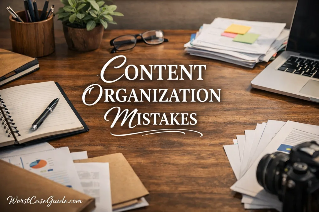
Why Content Organization Is Risky For Readability
Organization decisions tend to become sticky. Once a site, knowledge base, or doc set has a category tree and a heading style, new pages copy the pattern. If the pattern is slightly off, it scales into a systemic readability problem rather than a one-page issue. In smaller projects, readers tolerate more friction. In larger systems, the same friction turns into missed information and repeated support questions.
Good to keep in mind: Many readers arrive mid-page from search, a share link, or an internal tool. They often skip navigation and rely on on-page signals to decide whether the page is worth reading.
Common Assumptions That Backfire
The Mistakes That Quietly Lower Readability
Mistake 1: Treating Navigation and Page Structure As The Same Thing
Why It Happens
Teams often assume the site menu provides enough orientation, so the page itself can be loosely structured. That works only for readers who enter through navigation paths. Many readers do not.

Early Warning Signs
Worst-Case Outcome
Readers misjudge the page as irrelevant within seconds, or they miss critical constraints buried below. In a product or policy context, that can lead to misuse and unnecessary support load rather than dramatic failure.
Safer Approach
On-page structure can stand alone: a clear opening statement, an outline-like heading ladder, and section titles that match how readers search mentally. Navigation can stay helpful without being a dependency.
Mistake 2: Mixing Multiple Reader Intents On One Page
Why It Happens
A single page becomes a catch-all: overview, step-by-step, troubleshooting, and policy notes. It looks complete from the author’s side, yet it forces readers to filter constantly. The page has weak information scent.
Early Warning Signs
Worst-Case Outcome
Readers cherry-pick the wrong parts and skip prerequisites. In operational docs, that can mean avoidable mistakes and inconsistent outcomes across teams. The content is “there” but not reliably usable.
Safer Approach
Separate pages or clearly separated sections by intent: “Overview”, “Steps”, “Common Issues”, “Edge Cases”. If the content must stay on one page, a simple table-of-contents and consistent section order reduce drift.
Mistake 3: Burying The Main Point Under A Long Preamble
Why It Happens
Authors want to be thorough, so they start with background, history, and definitions. The reader’s first need is usually orientation: “What is this page for?” and “What will I get from it?” Without that, the rest becomes harder to trust and follow.
Early Warning Signs
Worst-Case Outcome
Readers misinterpret the page goal and apply the guidance in the wrong context. In a knowledge base, that can create repeat visits and low confidence: the reader leaves, returns, and still feels unsure.
Safer Approach
Lead with a short purpose statement and the primary decision or outcome the page supports. Background can stay, yet it reads better when it sits under a clearly labeled section like “Context”.
Mistake 4: Using Inconsistent Heading Hierarchy
Why It Happens
Headings get added during edits without checking the outline logic. Visual styling can hide the issue: two headings may look similar while representing different levels. Readers rely on the hierarchy to predict what comes next.
Early Warning Signs
Worst-Case Outcome
Readers lose their place and stop scanning effectively. In longer pages, they may miss important exceptions or think two sections are related when they are not. This often shows up as misquotes of the content inside teams.
Safer Approach
A simple rule helps: each heading level answers one type of question. For example, H2 = major topic, H3 = subtopic, H4 = detail. Consistency matters more than perfect theory.
Mistake 5: Overusing Emphasis, Colors, and Styling As Organization
Why It Happens
When structure is weak, styling becomes a substitute: bold everywhere, colored phrases, lots of callouts. Visual noise makes it harder to see what is actually important. Emphasis works when it is rare and tied to meaning.
Early Warning Signs
Worst-Case Outcome
Key warnings and constraints blend into the background. Readers may miss the few details that carry real risk. In regulated or safety-adjacent content, this becomes a compliance and interpretation problem rather than a stylistic one.
Safer Approach
Let headings and lists carry most of the organization. Keep emphasis for truly high-value information: definitions, constraints, thresholds, and exceptions. A calmer page makes signal stand out.
Mistake 6: Writing “Wall” Paragraphs Without Chunking
Why It Happens
Long paragraphs can feel efficient to write because they preserve flow. Readers rarely experience them as flow. They experience them as work, especially on mobile. Chunking is a structural aid: it turns ideas into grab-able units with clear boundaries.
Early Warning Signs
Worst-Case Outcome
Readers abandon before reaching the sections that answer their question. In internal documentation, that can lead to shadow docs and unofficial summaries, which increases drift. Readability losses become process losses.
Safer Approach
When a paragraph contains multiple claims, conditions, or steps, it often benefits from a split into smaller paragraphs or a short list. The goal is not minimal text; it is visible structure that supports scanning.
Mistake 7: Creating Lists Without Labels or Grouping Logic
Why It Happens
Lists get added quickly: features, tips, requirements, examples. Without a label and grouping rule, the list becomes a pile. Readers ask: “Are these steps, options, or priorities?” Unclear lists reduce trust and speed.
Early Warning Signs
Worst-Case Outcome
Readers choose the wrong item or treat an optional point as required. In a setup guide, they may skip a prerequisite and then blame the system rather than the information design. The result is more back-and-forth and lower confidence.
Safer Approach
List labels can clarify the rule: “Requirements”, “Common Causes”, “Options”, “Non-Goals”. If the list mixes categories, it can be split into two lists or grouped under small subheadings. Readers get predictability and faster decisions.
Mistake 8: Over-Nesting Categories Until Everything Is Three Clicks Away
Why It Happens
Deep hierarchies feel tidy, especially to subject-matter experts. Readers experience deep trees as uncertainty: each click is a guess. If a category name is slightly ambiguous, the reader starts backtracking. In larger systems, this becomes a real time cost.
Early Warning Signs
Worst-Case Outcome
Important pages become effectively invisible. Teams may rewrite content that already exists because it is not discoverable. Over time, the system collects near-duplicates with conflicting details, which damages trust and readability.
Safer Approach
Shallower structures can be readable when each category has a clear definition and readers can see “neighbors” easily. Tagging, cross-links, and short “related” sections can reduce the need for deep nesting while preserving findability and context.
Mistake 9: Naming Sections With Clever Labels Instead Of Reader Language
Why It Happens
Internal teams use shorthand and metaphors that feel natural in meetings. Readers do not share that context. A label that is cute or brand-y can be hard to interpret during scanning. Readability relies on recognition, not decoding inside jokes.
Early Warning Signs
Worst-Case Outcome
Readers miss relevant sections because the label does not match their mental query. In a help center, that often shows up as search failures and a perception that the site “doesn’t cover” a topic that is actually present. The content becomes underused and undertrusted.
Safer Approach
Labels that mirror reader language typically improve scanning. Short, concrete nouns and verbs tend to work: “Billing Issues”, “Reset Password”, “Data Export”. If branding is important, it can live in the design while the label stays descriptive.
Mistake 10: Forgetting Orientation Cues Inside Long Pages
Why It Happens
Long pages assume continuous reading. In practice, readers jump, return later, or arrive at a subsection link. Without orientation cues, they do not know where they are in the overall map. Readability drops when the page lacks progress markers and section context.
Early Warning Signs
Worst-Case Outcome
Readers misapply a subsection outside its intended scope. In process documentation, that can produce inconsistent execution: one team follows a section meant for edge cases as the default. The document becomes a source of variance rather than clarity.

Safer Approach
Orientation can be light: a short “This section covers…” line, consistent headings, and a visible table of contents when the page is long. Even small cues reduce the need for readers to reconstruct the outline in their heads.
Mistake 11: Designing Structure For Desktop Reading Only
Why It Happens
On desktop, multiple columns, long lines, and dense nav can still feel manageable. On mobile, the same layout becomes scroll-heavy and harder to scan. Organization choices like heading length, list density, and section depth have different effects on a narrow screen and touch navigation.
Early Warning Signs
Worst-Case Outcome
Mobile readers abandon earlier and share less. If a large share of traffic is mobile, the content can look “low quality” despite strong writing. This can reduce trust and increase reliance on alternative sources inside the organization.
Safer Approach
Shorter headings, smaller chunks, and clearer section separation tend to travel well across devices. When a page contains complex material, placing the key decision points near the top and repeating brief orientation cues can reduce mobile scanning errors.
Mistake 12: Letting Structure Drift Over Time Without Maintenance Rules
Why It Happens
Content systems grow through many authors and edits. Without shared rules, structure becomes inconsistent: old pages use one template, new pages use another, and mid-era pages mix both. This is entropy, not a single mistake. It shows up as readability decay across the library.
Early Warning Signs
Worst-Case Outcome
Readers stop trusting the library as a whole. They may treat every page as possibly wrong and look elsewhere. In internal environments, this often leads to parallel docs and tribal knowledge, which further reduces consistency and readability.
Safer Approach
Light governance can help: a standard section template for common page types, a small set of heading rules, and periodic clean-up focused on the highest-traffic pages. Maintenance is not only about accuracy; it protects structural predictability, which supports reading speed and confidence.
Quick Diagnostic Table: Symptoms And Likely Organization Causes
| Reader Symptom | Likely Organization Cause | Low-Effort Check |
|---|---|---|
| “I can’t find the part I need.” | Weak headings, missing chunking, deep nesting | Scan only headings: do they form a clear outline? |
| “This feels overwhelming.” | Wall paragraphs, mixed intents, visual noise | Look for long blocks with no lists or subheadings |
| “Is this for me?” | No purpose statement, unclear audience level | First 10 seconds test: is scope obvious? |
| “I followed it, but got a different result.” | Hidden prerequisites, inconsistent structure across pages | Compare two similar pages: same section order? |
| Readers copy partial text out of context | Missing orientation cues inside long pages | Check if sections start with a framing sentence |
Short self-check questions (useful during editing)
- Could a reader understand the page purpose in one sentence?
- Do headings read like a logical outline without the body text?
- Does each section have one primary job rather than three?
- Would labels still make sense to someone outside the team vocabulary?
Risk Patterns That Show Up Across Readability Failures
Across all mistakes, a few patterns repeat. They are less about grammar and more about reader effort. When the structure causes frequent context switching, readers lose the thread. When labels force interpretation, scanning slows. When pages lack predictability, readers become cautious and stop trusting that the next section will answer the question they have.
FAQ
What is the fastest way to spot organization problems on a page?
A quick method is to read only the headings in order. If they do not form a coherent outline, readers will likely struggle. Another simple check is the first screen: if the purpose, scope, and section map are unclear, scanning friction usually follows.
How many headings should a readable article have?
There is no universal number. Readability improves when headings reflect real topic boundaries and help readers predict what comes next. If headings are too few, the page becomes a scrolling wall. If headings are too many, the outline can feel fragmented and repetitive.
Is a deep category structure always bad for readability?
Not always. Deep structures can work when category labels are unambiguous and each level adds a clear decision. The risk increases when branches contain only a few pages, when content fits multiple places, or when readers rely on guessing rather than recognition.
Why does “too much formatting” reduce readability even if it highlights key points?
Emphasis works through contrast. When everything is highlighted, nothing stands out. Readers spend more effort deciding what matters instead of absorbing the content. A calmer page lets structure do most of the work, while emphasis stays reserved for real constraints and exceptions.
What changes help both readability and maintenance over time?
A small set of shared patterns tends to help: a consistent section template for common page types, stable naming rules for headings, and periodic review of high-traffic pages. These choices reduce structural drift, which is a common source of long-term readability decay.