Clean dashboards can still push teams in the wrong direction. That is what makes analytics setup risky: the numbers often look calm, tidy, and convincing long before anyone checks whether they mean the same thing across pages, devices, channels, and reporting periods. A chart can act like a polished mirror that reflects the wrong room. Decisions built on that mirror may look reasonable for weeks, then start costing time, budget, and trust.
Many setup mistakes are not dramatic. They are small translation errors between user behavior and measurement: a missing event, a duplicated conversion, a broken filter, a naming rule that drifted over time. In smaller projects, the damage often appears as wasted effort. In larger systems, the same issue can reshape product priorities, campaign reporting, and executive reporting at the same time.
What makes this topic hard? Teams rarely debate analytics when everything seems normal. The danger sits in false confidence: reports look stable, people stop questioning them, and weak assumptions slowly become operating truth.
Why This Topic Feels Safe Until It Is Not
Analytics setup problems usually begin before analysis. The trouble starts when measurement rules are treated as technical plumbing rather than business definitions. One team calls a lead “submitted form.” Another calls it “qualified contact.” A third team adds both as conversions. The report still loads. The totals still move. What exactly is being compared then?
There is also a timing problem. Bad measurement compounds quietly. A broken setup may sit under monthly reports, weekly standups, and quarterly planning without drawing attention because the trend line still moves in a believable way. That makes correction slower. It also makes later debates more emotional, since numbers tied to past decisions are hard to revisit.
Common Assumptions That Distort Measurement Early
- If the dashboard loads, the data must be reliable. A live chart only proves that collection exists, not that definitions are clean.
- More tracked events mean better visibility. In practice, extra noise often hides the signal.
- A platform default is close enough. Default settings help with speed, though they rarely match every workflow, consent model, subdomain, or internal traffic pattern.
- Historical data stays comparable after setup changes. It may not. A renamed event or new filter can split the story in half.
- Teams will remember what a metric meant. They usually remember the label, not the rule behind it.
| Mistake | What It Usually Distorts | Early Sign | Safer Check |
|---|---|---|---|
| Undefined goals | Report focus | Many charts, weak decisions | Match every tracked conversion to a business question |
| Internal traffic mixed in | User behavior trends | Traffic spikes during office hours | Compare filtered and unfiltered views |
| Naming drift | Trend continuity | Similar events with slightly different labels | Maintain one event dictionary |
| No validation routine | Trust in dashboards | Teams spot issues only after reporting meetings | Review raw hits, tags, and dashboard outputs together |
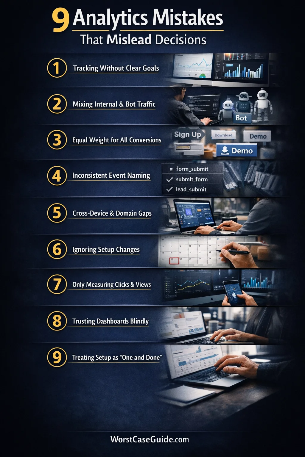
9 Mistakes That Mislead Decisions
Mistake 1: Tracking Activity Before Defining The Decision It Should Support
Why it happens: teams often start with the tool, not the question. A tag manager gets installed, standard events are added, dashboards appear, and measurement grows around what is easy to capture rather than what the business is actually trying to learn.

Early warning signs: reports are full of page views, clicks, scrolls, and sessions, yet simple planning questions stay unanswered. Stakeholders keep asking for custom cuts because the original setup never mapped metrics to decisions.
Worst-case result: teams optimize for visible movement instead of useful outcomes. A page redesign may look successful because click volume rose, while lead quality, task completion, or retention quietly worsened.
Safer approach: measurement tends to hold up better when each tracked outcome has a plain-language purpose attached to it. If a metric cannot explain which decision it informs, its place in the main dashboard may deserve a second look.
Mistake 2: Letting Internal, Test, And Bot Traffic Blend With Real User Behavior
Why it happens: filtering is often treated as cleanup work that can wait. Product teams, agencies, QA staff, developers, and automated tools keep touching the site while reports keep counting everything as user demand.
Early warning signs: traffic rises during work hours, obscure pages suddenly attract visits, or a new feature shows perfect engagement on the same day the internal team was testing it.
Worst-case result: false demand signals start shaping roadmap choices. Teams may keep a weak feature, cut a useful page, or overvalue a campaign because their own activity is sitting inside the same dataset as customer behavior.
Safer approach: filtered views, test properties, and documented exclusions usually reduce this risk. In smaller projects, simple IP and environment rules may be enough. In larger systems, identity-based exclusions and QA-specific test streams tend to age better.
Mistake 3: Counting Every Conversion As If It Carries The Same Weight
Why it happens: once a platform allows many events to be marked as conversions, teams start tagging almost every useful interaction that way. Newsletter signup, demo request, account creation, file download, and support click end up living under one label.
Early warning signs: conversion totals look healthy, though the business still feels uncertain about results. Different teams cite the same headline number while meaning very different user actions.
Worst-case result: reporting becomes flattering but vague. A campaign that produces many light actions may outrank one that generates fewer but more meaningful outcomes. Planning shifts toward volume because the scoring system treats unlike actions as equals.
Safer approach: a tiered model often creates clearer decisions: primary outcomes, secondary outcomes, and supporting signals. That keeps the dashboard readable without pretending that all intent levels are the same.
Mistake 4: Using Inconsistent Event Names, Parameters, And Definitions Across Teams
Why it happens: analytics changes tend to arrive through many hands. One release uses form_submit, another uses submit_form, a later one adds lead_submit. The labels look close enough in isolation, then drift becomes normal.

Early warning signs: analysts keep merging metrics manually, documentation lags behind releases, and dashboards need repeated caveats. Small spelling changes start producing separate lines in reporting.
Worst-case result: trend analysis breaks. The organization thinks it is comparing one stable metric over time, while the metric is really a stitched set of near-duplicates with changing rules underneath.

Safer approach: a shared event dictionary, release reviews, and plain naming rules usually reduce rework. The goal is not perfect elegance. It is semantic consistency that survives team changes.
Mistake 5: Ignoring Cross-Domain, Cross-Device, Or Identity Gaps
Why it happens: many journeys now move across landing pages, apps, payment environments, help centers, and separate subdomains. Setup stays local to one surface, while the user journey does not.
Early warning signs: referral self-traffic appears, session breaks happen at handoff points, assisted channels look weak, and mobile-to-desktop behavior seems oddly disconnected from what customer-facing teams report.
Worst-case result: attribution and funnel reporting begin to punish the wrong steps. Teams may underinvest in pages or channels that start the journey because the later steps are being counted in isolation.
Safer approach: if the journey crosses domains or devices, the measurement model may need to reflect that reality instead of assuming one browser session tells the whole story. Even a short documented list of handoff points can reveal where the blind spots really are.
Mistake 6: Comparing Time Periods Without Marking Setup Changes
Why it happens: teams often remember product releases but forget analytics releases. A filter is added, an event is rewritten, consent behavior changes, or duplicate firing is fixed. The monthly report still compares “before” and “after” as if the metric definition never moved.
Early warning signs: a line jumps sharply on the date of a tag update, conversion rate improves with no matching business explanation, or one segment changes while adjacent metrics stay flat.
Worst-case result: a reporting gain gets celebrated as a real performance gain. That can lock teams into a false narrative, especially when those numbers travel upward into planning meetings and performance reviews.
Safer approach: setup-change logs help because they keep the story honest. If you are in this situation, side-by-side annotations and “definition changed here” notes often matter more than another polished chart.
Mistake 7: Measuring Only What Is Easy To Capture
Why it happens: digital platforms naturally favor on-screen actions. They capture clicks, sessions, and views with very little friction, so teams start treating visible interaction as the whole outcome.
Early warning signs: reports explain traffic and interface behavior in detail, though they stay thin on lead quality, support load, downstream task completion, offline follow-through, or team-handled outcomes.
Worst-case result: work gets optimized for the front half of the journey while the back half absorbs the pain. A campaign may look efficient in analytics and still create poor-fit leads, confused users, or extra manual handling.
Safer approach: not every useful outcome lives inside one analytics tool. In smaller projects, even a light reconciliation habit between analytics data and operational outcomes can expose weak assumptions early.
Mistake 8: Trusting Dashboards Without Raw Validation
Why it happens: dashboards are convenient, visual, and easy to share. Over time, the polished layer starts feeling more real than the underlying collection logic, tags, request payloads, and processing rules that feed it.
Early warning signs: no one checks live events during releases, analysts rely on dashboard totals alone, and disagreements about metrics turn into opinion contests because there is no validation trail.
Worst-case result: a broken metric earns institutional trust. That is the hard part. Once a number becomes part of weekly language, correcting it can feel like rewriting history rather than fixing measurement.
Safer approach: periodic checks between raw collection, tag behavior, and final reporting usually catch drift earlier. The dashboard is the shop window; the stock room still matters.
Mistake 9: Treating Analytics Setup As A One-Time Project
Why it happens: setup is often funded like a launch task. Once the initial implementation is done, ownership becomes fuzzy. Product changes continue, consent tools change, pages move, forms get replaced, and the measurement layer quietly ages.
Early warning signs: nobody owns QA after release, alerts do not exist, documentation is stale, and issues are found only when a report looks odd enough to trigger debate.
Worst-case result: the organization keeps making decisions with a measurement system that no longer matches the product it is supposed to describe. Small gaps pile up until trust falls all at once.
Safer approach: analytics usually behaves better when it is treated as an operating system, not a launch checklist. Ongoing reviews, simple ownership rules, and change-aware QA can keep ordinary releases from turning into silent reporting failures.
Risk Patterns That Show Up Again And Again
- Definition drift: the label stays the same while the rule underneath changes.
- Convenience bias: teams favor data that is easy to collect, not data that reflects the whole outcome.
- Presentation trust: polished dashboards receive more trust than raw validation.
- Ownership gaps: implementation is clear, maintenance is vague.
- Comparability errors: old and new data are placed side by side without enough context.
These patterns matter because they do not stay inside analytics. They shape priorities, reporting language, and team memory. Once a metric becomes part of everyday planning, even a modest setup flaw can travel farther than expected. That is why the safer question is often not “Do we have data?” but “What exactly is this data allowed to claim?”

FAQ
How often does analytics setup need to be reviewed?
Review cycles usually depend on change frequency. If releases are frequent, monthly checks often make more sense than waiting for a quarterly audit. In slower environments, a lighter cadence may work, though any major product, form, consent, or domain change tends to justify an extra review.
Is more tracked data always better for decision-making?
Not always. More data can create more ambiguity when naming, classification, and priority rules are weak. A smaller set of well-defined metrics often supports better planning than a very large set of loosely related events.
Why do dashboards look healthy when the setup is weak?
Because visual stability is not the same as measurement accuracy. A dashboard can still populate charts while conversions are duplicated, filters are missing, or naming rules have drifted. The report looks complete; the meaning underneath it may not be.
What is the first sign that analytics is misleading decisions?
A common sign is when teams keep debating what a metric means even though the label seems familiar. Another is when reported gains do not match operational reality—for example, more reported conversions without a matching improvement in downstream outcomes.
Can small websites face the same analytics risks as larger systems?
Yes. The scale differs, though the pattern is often the same. In smaller projects, one filter or one duplicated event may skew a large share of the data. In larger systems, the same kind of flaw tends to spread across more teams and reports.
{
“@context”: “https://schema.org”,
“@type”: “FAQPage”,
“mainEntity”: [
{
“@type”: “Question”,
“name”: “How often does analytics setup need to be reviewed?”,
“acceptedAnswer”: {
“@type”: “Answer”,
“text”: “Review cycles usually depend on change frequency. If releases are frequent, monthly checks often make more sense than waiting for a quarterly audit. In slower environments, a lighter cadence may work, though any major product, form, consent, or domain change tends to justify an extra review.”
}
},
{
“@type”: “Question”,
“name”: “Is more tracked data always better for decision-making?”,
“acceptedAnswer”: {
“@type”: “Answer”,
“text”: “Not always. More data can create more ambiguity when naming, classification, and priority rules are weak. A smaller set of well-defined metrics often supports better planning than a very large set of loosely related events.”
}
},
{
“@type”: “Question”,
“name”: “Why do dashboards look healthy when the setup is weak?”,
“acceptedAnswer”: {
“@type”: “Answer”,
“text”: “Because visual stability is not the same as measurement accuracy. A dashboard can still populate charts while conversions are duplicated, filters are missing, or naming rules have drifted. The report looks complete; the meaning underneath it may not be.”
}
},
{
“@type”: “Question”,
“name”: “What is the first sign that analytics is misleading decisions?”,
“acceptedAnswer”: {
“@type”: “Answer”,
“text”: “A common sign is when teams keep debating what a metric means even though the label seems familiar. Another is when reported gains do not match operational reality—for example, more reported conversions without a matching improvement in downstream outcomes.”
}
},
{
“@type”: “Question”,
“name”: “Can small websites face the same analytics risks as larger systems?”,
“acceptedAnswer”: {
“@type”: “Answer”,
“text”: “Yes. The scale differs, though the pattern is often the same. In smaller projects, one filter or one duplicated event may skew a large share of the data. In larger systems, the same kind of flaw tends to spread across more teams and reports.”
}
}
]
}